
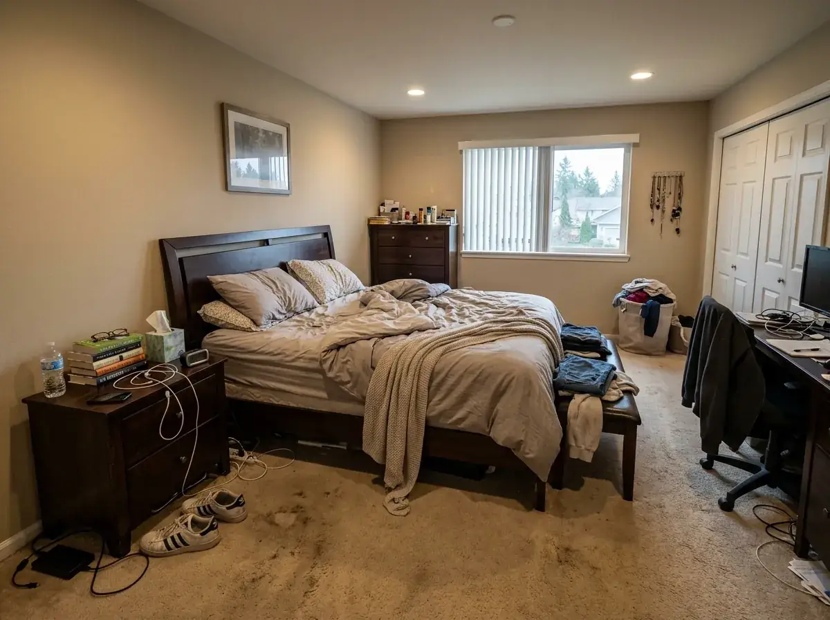

A primary bedroom that lands as cluttered, dark, or sleep-hostile is almost never a furniture problem. It is a circulation problem, a daylight problem, or a storage problem wearing furniture as a costume. The ten resets below take the same compact primary footprint and walk it through ten complete design directions — light Japandi, fluted-panel neutral, boho rattan, plaster-wall Southwest, coastal canopy, Scandi minimal, transitional molded, modern cottagecore, plant-led bohemian, and saturated navy-and-brass. Each reset is reviewed as an architect would read it: what the floor plane is doing, where the daylight is landing, how the storage program got resolved, and whether the room finally earns the square footage it is sitting on.
I’m Elliot Calloway — Portland-based architect, eight-plus years on the boards, focused on compact homes, ADUs, and modern under-2,200 sqft plans across the PNW and Mountain West corridor. Compact primaries are the room my clients ask about most often, because they spend roughly a third of every twenty-four hours in them and because they have usually inherited a leftover-shaped box from a 1950s-1990s tract plan that the rest of the house’s circulation handed them. None of the ten directions below requires structural work. All of them require somebody to make actual decisions about flooring, wall planes, light layers, and what the bed is doing for the rest of the room. Walk through all ten, then read the FAQs at the bottom for the questions clients ask once they have picked a direction.
What’s in this article
- Modern Japandi Oasis
- Textured Neutral Haven With Fluted Wall Panel
- Boho Rhapsody With Rattan & Gallery Wall
- Earthy Southwest Retreat With Lime-Wash Walls
- Coastal Canopy Dream
- Minimalist Scandi Calm With Floating Shelves
- Elegant Transitional Escape With Picture-Frame Molding
- Modern Cottagecore Cozy With Brass Wall Sconces
- Bohemian Jungle With Layered Plants
- Saturated Navy & Brass Compact Suite
- Pro Tips From the Drafting Board
- Regional Fit: PNW & Mountain West Notes
- Frequently Asked Questions
- Sources & References
- Final Thoughts
Who this article is for
- Owners of 130-220 sqft compact primary bedrooms in 1950s-1990s tract homes, 1920s craftsman primaries, and ADU primary suites who want a clear direction before they start spending.
- Renovators who have lived with the inherited dark-carpet, popcorn-ceiling, generic-fan-light bedroom long enough to know it is not working and now need ten side-by-side examples of what does work.
- Anyone in the early decision phase of a primary reset who wants to see the same compact box read as ten distinct rooms before committing the budget to one direction.
- Readers who already know the calm-sanctuary brief and want the architectural reasoning underneath each look, not another mood-board carousel.
1. Modern Japandi Oasis
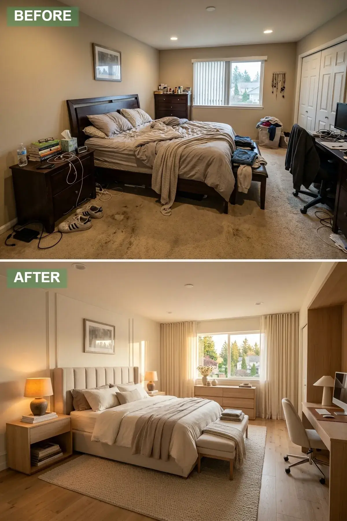
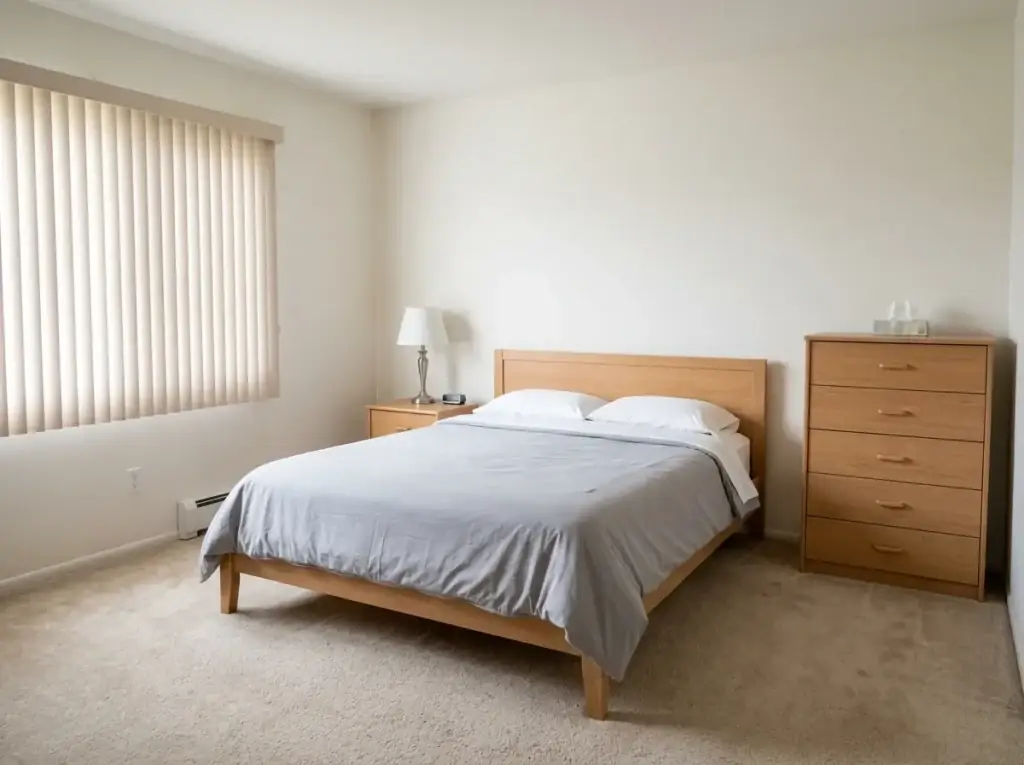
The first reset is the one I sketch most often for PNW compact primaries because Japandi reads the daylight we actually get — overcast, indirect, gentle — better than almost any other modern direction. The original room’s dark wall-to-wall carpet was the single largest visual problem: a dark floor plane in a 12×14 bedroom compresses the volume by what feels like two feet of ceiling height before any furniture is placed. Replacing it with wide-plank light oak engineered flooring (5-7 inch widths in a UV-cured matte finish) lifts the room into the daylight register the windows were already trying to deliver. The bed is dropped to a low channeled-upholstery platform in oatmeal linen at roughly 14 inches off the floor — the lower the bed sits, the more wall plane the eye reads above it, and the more the ceiling appears to lift. Matching light-oak nightstands and a single low-slung dresser run as one continuous material register, which is the entire Japandi argument: one wood species, one disciplined tone, one room. Floor-to-ceiling sheer linen curtains on a ceiling-mounted track (not a window-mounted rod) read the window opening as taller than its physical frame — a 6-foot window on a ceiling-mounted track in a 9-foot room produces a 9-foot vertical line that the eye fills in as a single architectural gesture. Warm 2700K CRI 90+ bedside lamps on dimmers complete the lighting plan, with the overhead fixture relegated to “off after sundown.”
Color Palette
Light Oak
#D3C2A8
A warm, low-chroma natural floor that visually expands the room and absorbs PNW gray light without going clinical.
Warm Cream
#F2E8D9
Reads as soft daylight even on overcast mornings — Benjamin Moore Swiss Coffee OC-45 is the closest off-the-shelf match I default to.
Greige
#C9C0B5
A neutral that does the work without competing with the wood — the textured wool rug carries the visual interest the color is deliberately withholding.
Matte Black
#333333
A single contrast register on drawer pulls and lamp bases — grounding without weight, present without intrusion.
What This Reset Gets Right
- Pulling the dark carpet and dropping in wide-plank light wood is the single highest-leverage move in a compact primary — measurable lift in perceived ceiling height before any furniture changes.
- Ceiling-mounted curtain tracks instead of window-frame rods read the window taller, which is free architectural correction the manufacturer’s rod never delivers.
- Holding the wood species to one tone across bed frame, nightstands, and dresser is the Japandi discipline most pinterest-grade rooms fail at — collected-from-three-stores furniture reads as showroom, not as a room.
- Warm-temperature LED bulbs (2700K, CRI 90+) on dimmers respect circadian biology after sundown; the standard 3500K-4000K builder bulbs are the silent reason a lot of bedrooms feel “off” even when the styling is fine.
2. Textured Neutral Haven With Fluted Wall Panel
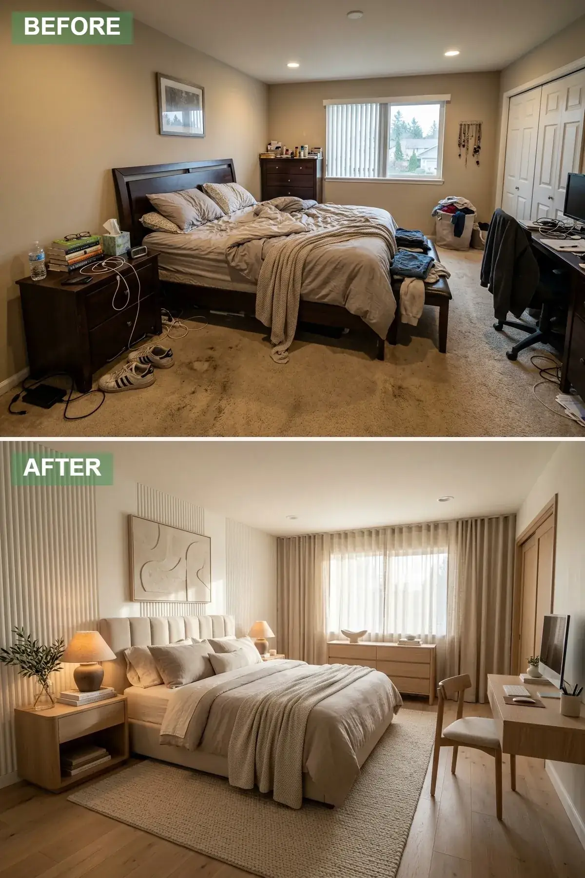
This direction is the textural cousin of the Japandi reset and the one I draft for clients who want the calm-neutral palette but find an all-painted room visually flat. The single decisive move is the full-height fluted wood panel spanning the wall behind the bed — vertical reeded MDF at roughly 3/4-inch reveal depth, primed and painted to match the wall color, or alternatively in a real white-oak veneer if the budget supports it. Fluting is an architectural detail that costs paint-equivalent dollars and reads as bespoke millwork; the shadow lines do the visual work that a colored accent wall would otherwise have to carry. The bed pulls forward two to three inches off the fluting, which keeps the panel reading as a backdrop rather than as a literal headboard. The rest of the room runs in natural ash or white-oak furniture in a single light register, with sculptural ceramic lamp bases (handmade or studio-pottery sourced) doing the small-scale art job that a gallery wall would otherwise do. A large soft abstract above the dresser balances the verticality of the fluting with a horizontal painted gesture, and the bedding stacks linen, wool, and cotton in the same sand-and-oatmeal family — three textures, one color. Floor plane stays light, curtains stay sheer to the ceiling, and the room reads as architecturally considered without any structural intervention.
Color Palette
Creamy Off-White
#F0EDE6
Holding the fluted panel and the surrounding wall in one paint color is what lets the shadow lines do the architectural work — color contrast would have killed the effect.
Natural Ash
#E0D3C1
Slightly cooler than oak — ash holds the airy register Japandi cannot quite achieve when the brief leans more Scandi than Japanese.
Sand Beige
#D8CFC2
The textural anchor — three different fiber types (linen, wool, cotton) in this one color is what carries the room.
Terracotta
#BFA68F
A studio-pottery warmth that reads as one or two intentional pieces rather than as a styled vignette — sourced from Heath Ceramics or a local Portland ceramicist works best.
What This Reset Gets Right
- Fluted wood paneling is the cheapest architectural detail per linear foot you can specify in a primary bedroom — primed MDF reeded panels run $4-8 per sqft and read as $40-per-sqft millwork once installed and painted.
- Painting the fluting and surrounding wall the same color is counterintuitive but architecturally correct — the shadow lines need monochrome to register; color competition flattens them.
- Sculptural lamp bases double as art at compact scale where a gallery wall would crowd the room — Heath Ceramics, Notary Ceramics (Portland), and small studio potteries are the sourcing register I default to.
- Limit the bedding to three textures in one color family — the temptation to add a second accent color is what turns a calm neutral room into a beige showroom.
3. Boho Rhapsody With Rattan & Gallery Wall
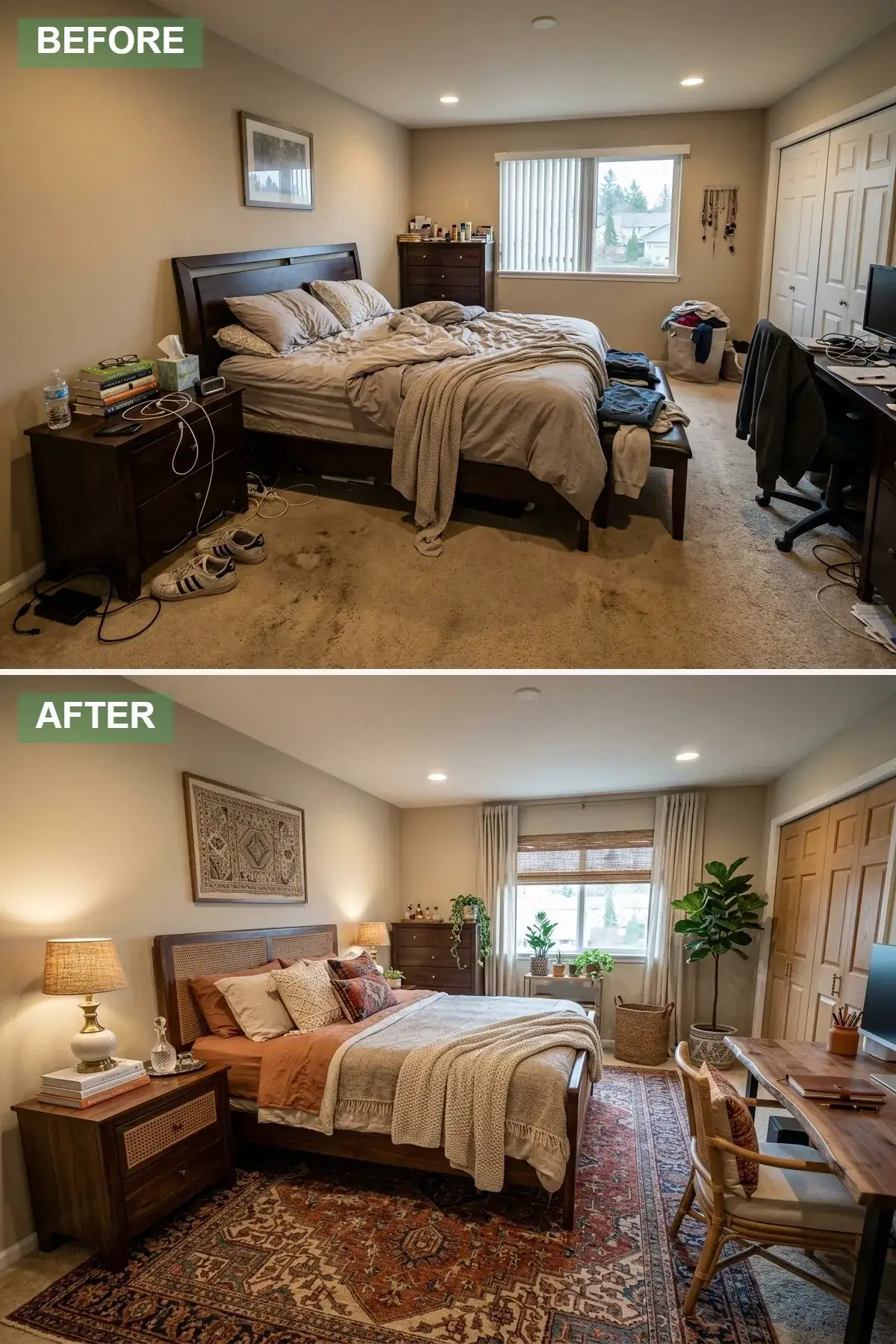
The boho reset is the right call when the client wants pattern, color, and visible personality in the room but cannot deal with a saturated paint job or moody-suite atmosphere. The structural move is a rattan-detail bed frame that brings breathable visual bulk without the closed-front mass of an upholstered platform — rattan reads light even at queen scale, which is critical in a 12×14 box. The matched-set dark furniture from the original room is replaced with medium-walnut mid-century pieces sourced as a mix rather than a suite: a small dresser from one source, two nightstands from another, a desk-and-chair from a third. The visual incoherence is the point — collected reads as personal where matched reads as showroom. A vintage-inspired rust-and-indigo wool area rug sized 8×10 (sized larger than the bed footprint so all four legs sit on the rug) brings the color the walls are deliberately not bringing. Above the bed, a curated gallery wall of 7-12 pieces mixes framed art prints, original watercolors, two textile hangings, and one or two unframed canvases — the mix of medium is what makes a gallery wall read as collected over years rather than ordered in a single batch. Bamboo blinds layered behind linen curtains filter the daylight twice and produce the warm honey-toned light that makes the room read as evening-warm even at 2 p.m. Hanging plants from ceiling hooks in the corner add height variation that the original room was missing entirely. For clients who want the same warm-collected calm in the living room instead, the companion direction is the quiet-luxury living room reset.
Color Palette
Natural Rattan
#C6A988
The breathable organic register that defines the boho move — rattan reads as warm and casual without the visual heft of upholstery.
Rust
#A8644A
A warm earth pop in the rug pattern and on one throw pillow — the single accent color that does the work without overwhelming a compact footprint.
Medium Walnut
#7A5941
Real walnut on the nightstands and dresser — the species reads as mid-century without dating the room to a specific decade.
Deep Cream
#E8DEC9
A slightly warmer cream than the Japandi neutral — the boho palette needs ambient warmth in the wall plane to make the rug colors look intentional, not loud.
What This Reset Gets Right
- Rattan and cane bed frames read lighter than equivalent upholstered or solid-wood frames at the same footprint — the visual breathing room matters in any primary under 180 sqft.
- Source the gallery wall over four to six weeks from at least three different vendors (one frame shop, one estate sale or thrift, one art-prints site) — single-source gallery walls read as styled, not as collected.
- Layering bamboo shades behind linen curtains produces filtered, warm-toned daylight that no single window treatment delivers — the doubled treatment also gives privacy plus blackout control without losing the visible texture.
- For boho specifically, the rug needs to be sized so all four bed legs sit on it — half-on, half-off rug placement is the single most common visual error that makes the rest of the styling look unanchored.
4. Earthy Southwest Retreat With Lime-Wash Walls
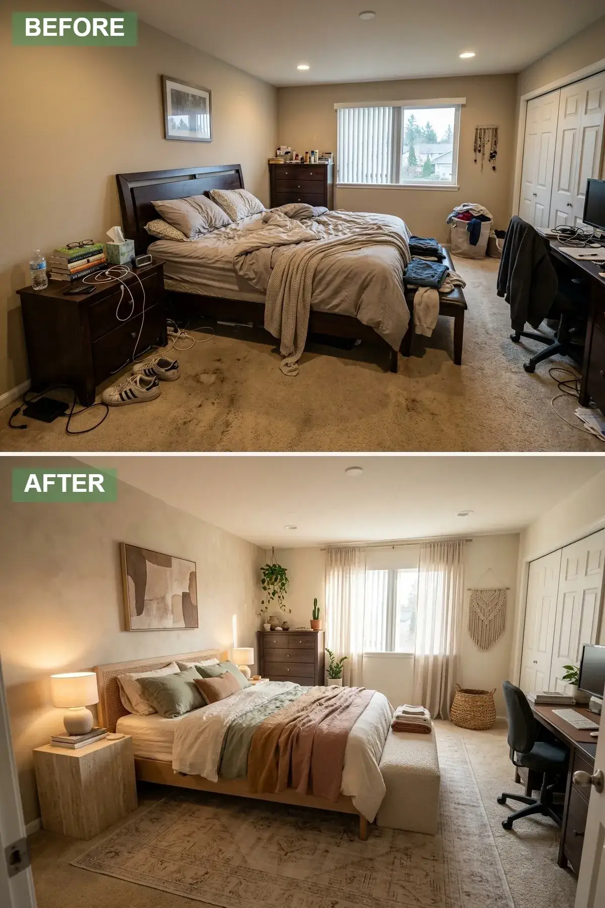
This direction reads as desert-modern but lands gracefully even in the PNW because the underlying mineral wall finish does atmospheric work that paint cannot. The single signature move is true lime-wash on all four walls — applied in two thin coats with a soft natural-bristle brush in cross-hatch motion, the finish develops chalky variation across each wall section that no roller-painted product can replicate. Romabio BioDomus I in a warm sand color is the spec I default to ($90-110 per gallon, two-coat coverage at roughly 350 sqft per gallon — so a 12×14 room with 9-foot ceilings runs $180-220 in product plus 4-6 hours of labor if applied DIY, or $1,600-2,400 installed by a Portland mason). The room then layers a cane-and-dark-wood platform bed with bedding in terracotta and sage tones — sage is the only green I draft into this palette because it reads as sun-bleached rather than as a primary color. One travertine block nightstand with subtle vein pattern brings the natural stone register; the other nightstand stays in a dark wood for contrast. A large macrame wall hanging replaces the framed art most rooms default to, which reads as soft architectural drape rather than as a separate hung object. Cacti and clay pottery in terra-cotta and unglazed stoneware populate the surfaces sparingly — three to five pieces is the right count, more starts to read as a desert-souvenir display.
Color Palette
Sand Plaster
#D6CFC2
A mineral wall finish develops cross-hatch chalky variation across the surface — real lime-wash does this on its own; the painted-on imitation product (Behr, Sherwin-Williams “lime-wash effect” paints) does not, and the difference reads at three feet of distance.
Clay Terracotta
#B58267
The warm sun-baked tone that anchors the Southwest direction — used on a single throw, two pillow shams, and the smaller pottery, no more.
Sage Green
#9EA895
The cool counterweight to the terracotta — sun-bleached rather than vivid, reads as desert sagebrush rather than as primary green.
Natural Travertine
#DACDB6
A solid travertine block as a nightstand reads as both furniture and as sculpture — vein-cut faces give the room a natural-pattern register that no painted finish reproduces.
What This Reset Gets Right
- True lime-wash (Romabio, Pure & Original, Bauwerk) versus the imitation roller-applied product is the difference between a wall that reads as architectural mineral and one that reads as faux finish — only the real lime-wash is worth the application.
- Sage and terracotta together is the canonical Southwest palette pairing because sage reads as the cool counterweight to terracotta’s warmth — adding a third saturated color almost always breaks the desert atmosphere.
- One travertine block nightstand plus one wood nightstand is the right asymmetry — matched-set nightstands flatten the Southwest read into something more transitional.
- Cacti, snake plants, and one or two euphorbias are the right plant register for this direction — fiddle-leaf figs and monsteras read as biophilic-modern rather than as desert, and break the look immediately.
5. Coastal Canopy Dream
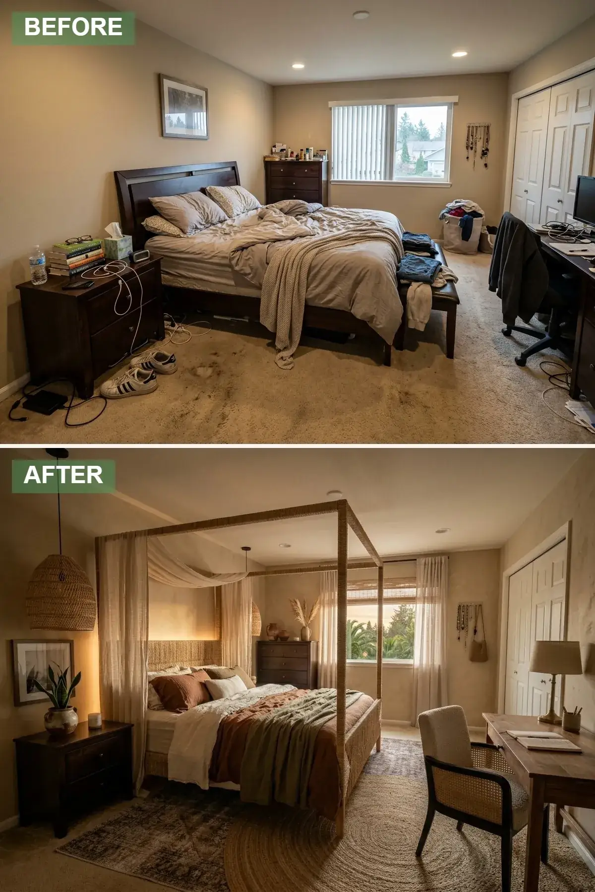
The canopy bed is the single move most clients underestimate for compact rooms because they assume a four-poster will eat the volume. In practice, a slim-profile wood canopy bed at 80-84 inches of overall height in a 9-foot-ceiling room reads as a defined bed zone within the larger room — it does the same architectural job a built-in alcove would, without the framing carpentry. The version drafted here uses a natural wood frame with rope-wrapped joints and sheer linen drape at the four corners, which softens the volume without enclosing it. The round jute rug layered over a vintage-style flat-weave rectangular rug is the floor-plane move that distinguishes this direction — the round-on-rectangle layering reads as collected and breaks up the rectangular geometry of the room itself. Two oversized woven seagrass pendant lights replace the recessed cans, hanging at roughly 28 inches off the ceiling and positioned to flank the bed without obstructing sightlines. A dark walnut dresser grounds the otherwise airy palette; dried pampas grass in tall stoneware vases adds vertical drama that the original room was missing. Sandy-beige plaster walls (or a plaster-effect paint like Portola Paints’ “Roman Clay”) complete the soft envelope. The result reads as coastal-boho without being a coastal cliche.
Color Palette
Natural Jute
#C9B28F
The dominant textural register — jute rug, woven pendants, and rope canopy details all read in the same warm fiber family.
Sandy Beige
#DED5C7
Plaster-effect paint or a true skim-coat plaster in a sandy color produces the softened-edge wall plane the coastal direction requires.
Burnt Orange
#A66D4F
A single warm accent on one throw or one pillow set — the burnt-orange register reads as sunset-warm against the sandy envelope.
Dark Walnut
#5C4533
The single dark anchor in an otherwise pale room — every airy palette needs one substantial dark register or the whole space reads as undercooked.
What This Reset Gets Right
- Slim-profile canopy beds (rather than heavy four-posters with crossbar tops) work in 9-foot-ceiling rooms — measure the canopy height against the ceiling and leave a 12-inch minimum reveal, anything tighter reads as compressed.
- The round-rug-over-rectangular-rug layering is the move that distinguishes coastal-boho from generic coastal; the round rug should be 6-7 feet in diameter and centered under the bed footprint.
- Oversized woven pendants (24-30 inches in diameter) read better than two undersized fixtures — scale up rather than multiply.
- Dried pampas grass needs to be sourced as the long-stem dried variety, displayed in stoneware vases at least 18 inches tall — anything shorter reads as a styling afterthought rather than as the vertical anchor the room needs.
6. Minimalist Scandi Calm With Floating Shelves
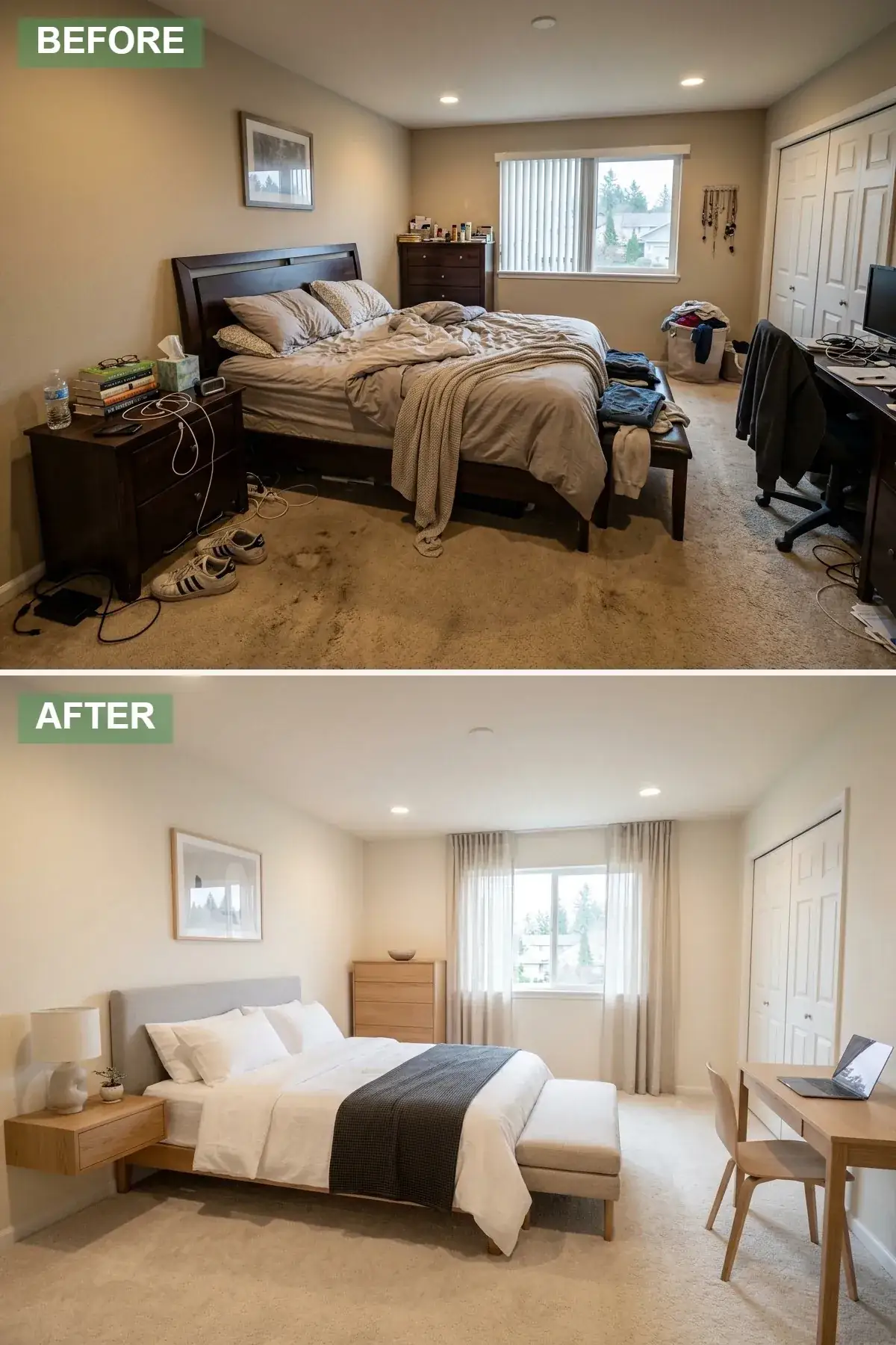
Scandi minimalism in a compact primary is less about styling and more about aggressive subtraction. The most consequential move in this reset is replacing both nightstands with floating wall shelves in light birch at bedside height — the floor plane runs continuously under the bed and out from it, which is the single largest contributor to perceived volume in any compact room. A floating shelf at 24-26 inches off the ground holds a lamp, a book, a glass of water, and nothing else. The sleek upholstered bed in light grey sits low to the floor with a closed-base silhouette to keep the under-bed plane visually empty. The dresser and any optional desk run in the same light birch or pale ash register as the floating shelves, which makes the few pieces of furniture in the room read as one continuous material decision. Bedding stays crisp pure white percale with a charcoal wool throw for contrast — the contrast is non-negotiable because a fully-white bed in a fully-pale room reads as undercooked rather than as minimal. Simple framed abstract art in black-and-white or muted greys; two pieces maximum. Floor-to-ceiling sheer curtains on a ceiling track. Nothing else. The Scandi argument lives or dies on the discipline to stop adding. For the bedroom variation focused specifically on biophilic sleep, the companion direction is the digital-detox biophilic bedroom.
Color Palette
Light Grey
#BDBDBD
A neutral fabric mid-tone that bridges the pure-white bedding and the charcoal throw — anchoring the bed without weight.
Light Birch
#E3D6C5
The canonical Scandi wood register — pale enough to read as nearly white, but with enough grain pattern to remain visibly wood rather than painted.
Pure White
#FFFFFF
Benjamin Moore Chantilly Lace OC-65 on the walls, white percale on the bedding — bright bouncing register that doubles the available daylight in PNW gray conditions.
Charcoal
#4F4F4F
The single high-contrast register the entire Scandi composition needs — applied on one wool throw, the artwork frames, and nothing else.
What This Reset Gets Right
- Floating nightstand shelves clear the floor plane and read as visibly wider — even three inches of clear floor under the bedside changes the perceived room dimensions.
- The Scandi palette discipline is white-plus-light-wood-plus-one-contrast, applied with religious consistency — every additional color is a step away from the look.
- Surface decluttering is non-negotiable: one lamp, one book, one glass of water on each floating shelf; one art piece per wall maximum; no decorative-object styling.
- Light birch is the right wood register over light oak or ash for the Scandi direction specifically — it reads slightly cooler and slightly more matte, which is the Nordic register the look requires.
7. Elegant Transitional Escape With Picture-Frame Molding
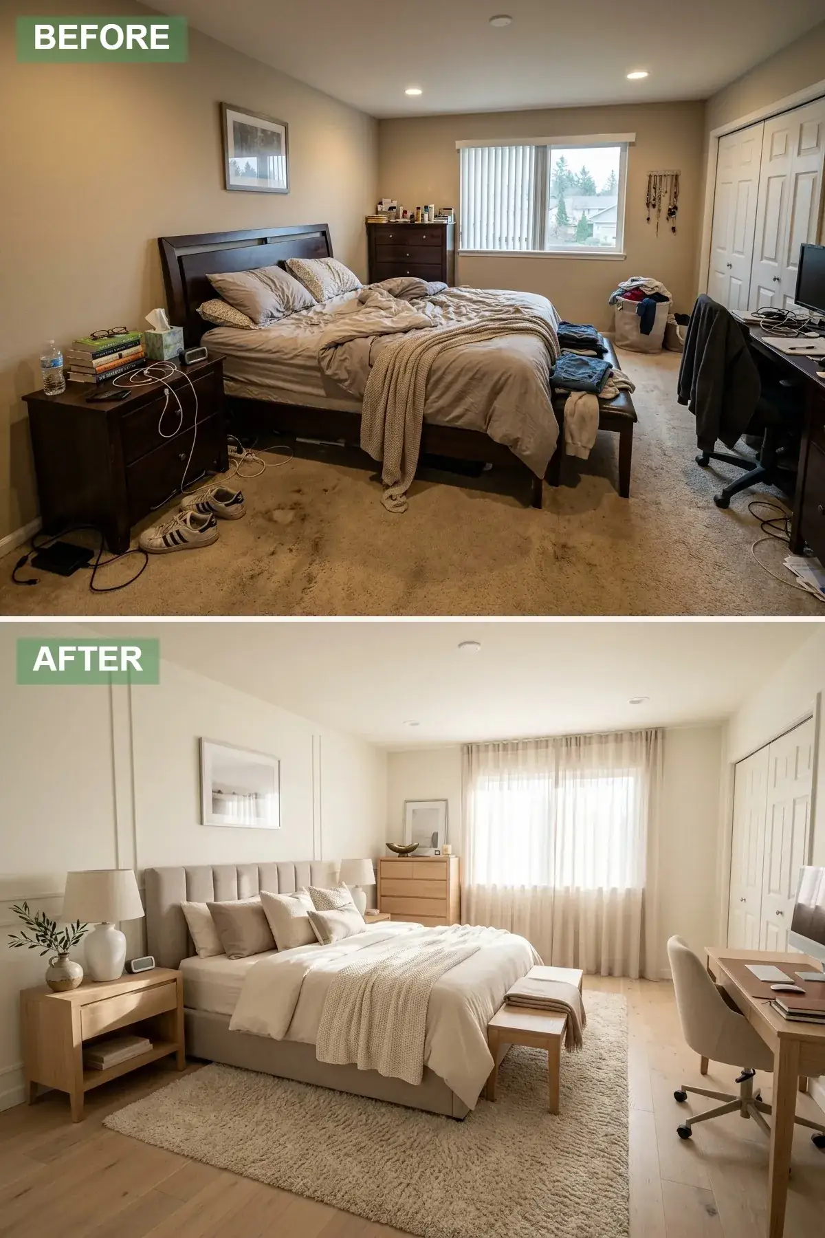
Transitional is the right direction for compact primaries in older PNW housing stock — 1920s-1940s Portland craftsmans and Tacoma four-squares — where the existing architectural detail (high baseboards, original window casings, picture rails) deserves to be played with rather than against. The defining move is adding picture-frame molding to the wall behind the bed, set in two or three horizontal panels of equal proportion. Off-the-shelf primed pine molding ($1.50-3.00 per linear foot from a real lumber yard, not big-box) installed with a pneumatic finish nailer runs $200-400 in materials for a single wall, plus 4-6 hours of labor if DIY. The molding is then primed and painted the same color as the wall itself — color contrast would have made this read as overworked traditional; matching paint lets the shadow lines do the architectural work, same principle as the fluted-panel direction. The bed runs in a channeled oatmeal upholstery with a tailored profile, light oak nightstands and dresser keep the wood register honest, and a plush cream shag rug layered over a larger flat-weave brings tactile warmth that the cleaner modern directions deliberately omit. Handmade ceramic bedside lamps (Heath Ceramics, Notary Ceramics, or a local Portland studio potter) add the artisanal register that makes a $10,000 bedroom read as $40,000. A curated stack of books on the nightstand — not styled, actually read — finishes the room.
Color Palette
Soft White
#F5F3EF
A warm white that lets the molding’s shadow lines do the architectural work — Benjamin Moore Simply White OC-117 or Farrow & Ball Slipper Satin No.2004 are the spec defaults.
Oatmeal Beige
#D9D0C3
A neutral that bridges warm and cool — the right tone for a transitional bedroom because it reads as comfortable, not committed to a single style.
Cream Shag
#F0EAD6
A high-pile texture register that contradicts the otherwise clean-lined room in exactly the right way — the contradiction is what makes transitional read as warm rather than as stiff.
Natural Oak
#D3C3A8
A timeless wood finish that works against both the painted molding and the upholstered headboard without competing with either.
What This Reset Gets Right
- Picture-frame molding is a roughly $400-700 architectural intervention (materials plus a competent DIY day) that reads as $4,000-7,000 carpentry — it is the highest dollar-leverage move in this entire article.
- Paint the molding the same color as the wall — color contrast on picture-frame molding reads as fussy traditional, monochrome reads as architectural elegance.
- Rug-on-rug layering (high-pile shag over a flat-weave) gives the bed area acoustic damping and tactile warmth without compromising the rest of the floor plane.
- One artisanal-pottery lamp pair is the single styling element that lifts this direction from “good builder-grade transitional” to “considered architect-grade transitional” — the rest of the room is doing standard moves.
8. Modern Cottagecore Cozy With Brass Wall Sconces
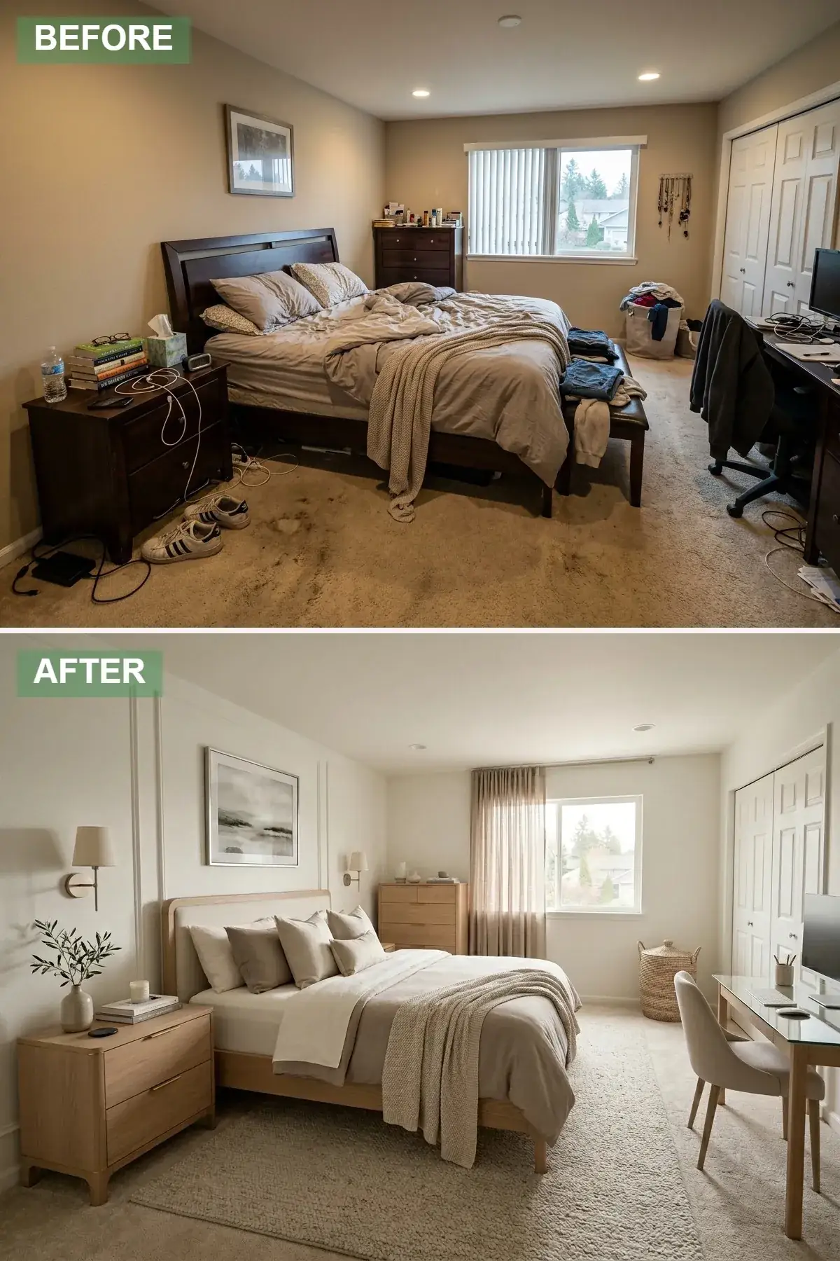
Modern cottagecore is the right direction for compact primaries that need warmth without leaning rustic — it works particularly well in 1990s-2010s tract homes with featureless flat-drywall walls and forgettable trim. The signature move here is replacing bedside table lamps with warm-brass wall sconces installed directly above each nightstand. The functional gain is significant: the nightstand surface clears completely (no lamp base eating the available square inches), and the light source moves up and out from the bed, which is better for reading and better for circadian wind-down than a lamp at pillow height. Spec dimmable sconces (Cedar & Moss Mendocino in unlacquered brass, or Schoolhouse Isaac Single Sconce in matte brass) on independent Lutron Caséta wireless switches so each side of the bed can dim independently from the bedside — the boutique-suite move at $200 instead of $2,000. Wall paneling (board-and-batten or simple painted-MDF shaker panel) adds light cottagecore architectural texture without going barn-rustic. The wood bed frame with upholstered cream headboard bridges rustic and refined; light oak nightstands keep the wood register warm. A large woven seagrass basket in the corner doubles as a laundry hamper and a sculptural element — practical storage masquerading as styled prop. Calming landscape art (one or two pieces, not a gallery) and sheer linen curtains complete the look.
Color Palette
Light Oak
#D8C8B0
A warm wood register that nods rustic without going barnwood — the light tone keeps the room reading airy.
Creamy White
#F2F0EB
Softer than pure white — Benjamin Moore White Dove OC-17 is the closest spec, suits the cottage register perfectly without going beige.
Warm Brass
#CFAA6D
Unlacquered brass patinas across 12-18 months — the soft amber drift is the design intent; lacquered or polished brass reads as imitation gold rather than as the warm vintage-cottage register the direction needs.
Natural Seagrass
#CCB694
The woven basket is the single textural register that prevents the cottagecore look from collapsing into all-painted-cream flatness.
What This Reset Gets Right
- Wall sconces above the nightstand clear the surface for what actually belongs there (book, glass of water, charging dock) and produce better reading light than any bedside lamp — the architectural win is functional, not stylistic.
- Board-and-batten or shaker paneling on one wall is a $200-500 DIY intervention that gives a flat-drywall room the architectural presence it was never built with.
- Unlacquered brass over lacquered or polished is the spec to insist on — the patina drift is the entire reason this hardware finish reads as cottage-warm rather than as imitation gold.
- One large woven basket is the right storage register for cottagecore — wicker, seagrass, or rattan, sized at 22-28 inches tall and 16-20 inches wide so it reads as substantial.
9. Bohemian Jungle With Layered Plants
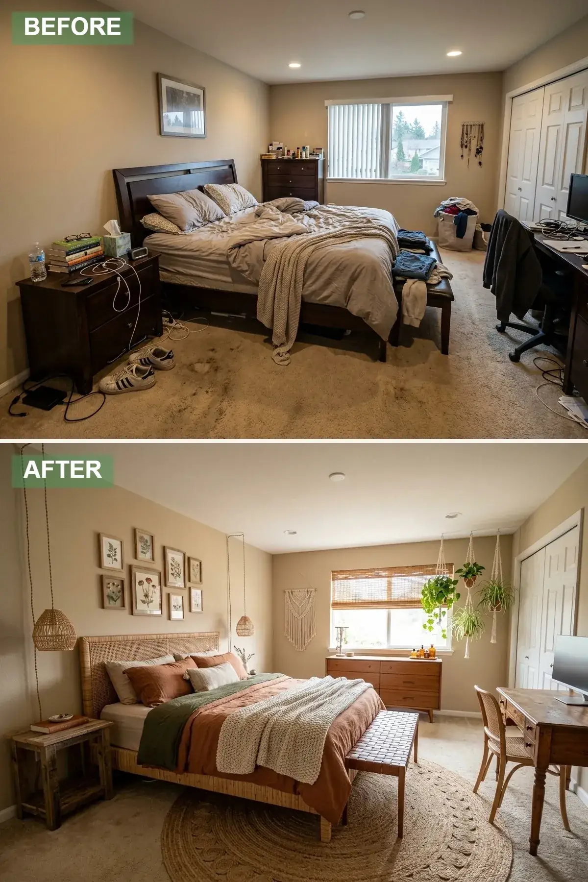
This direction takes the boho rattan reset and pushes it into full biophilic territory — plants are the primary design move, not the accent. The structural decisions remain: rattan bed frame, mid-century walnut nightstands and dresser, round jute rug, woven pendant lighting. What differentiates this direction from the third reset is plant count and plant variation. Twelve to twenty plants of varying heights populate the room — hanging from ceiling hooks (pothos, string of pearls, philodendron), on the dresser (smaller jade, peperomia, hoya), on the floor in large terra-cotta planters (fiddle-leaf fig, bird of paradise, monstera deliciosa), and on a tall plant stand near the window (snake plant, ZZ plant). The discipline that prevents this from reading as plant-shop-after-closing-time is varying the scale and the form: tall vertical plants near the corners, trailing plants from the ceiling, midsized plants on furniture, small plants on the dresser. A botanical gallery wall — pressed-flower frames, vintage botanical prints, one or two original watercolors — complements the living material register without competing with it. Macrame holders for the hanging plants are the right material choice over plastic or wire (the cotton rope echoes the rattan and jute palette running through the room).
Color Palette
Natural Rattan
#C6A988
The constant material register that anchors the boho direction across the bed frame, plant baskets, and decorative pieces.
Burnt Orange
#A36342
A warm pop against the green-dominant palette — used on one throw and the larger terra-cotta planters.
Forest Green
#4A633C
The dominant color from the layered plant life — this is the only direction in the article where green is the primary color and the room reads better for it.
Natural Jute
#C9B28F
The earthy floor register that grounds the dense plant population — a round jute rug 6-7 feet in diameter is the right size and shape.
What This Reset Gets Right
- Plant count for genuine jungle-feel is 12-20 plants minimum in a compact primary — anything less reads as “plants on furniture” rather than as the architectural envelope-shift this direction is going for.
- Vary the scale aggressively — three or four tall floor plants, four to six mid-sized, three to four hanging, the rest small — uniform-sized plants flatten the visual layering immediately.
- South or east-facing windows are required for sustained healthy plant volume at this density — west and especially north-facing PNW windows will struggle to keep this many plants thriving in winter months without supplemental grow lights.
- Real terra-cotta over plastic planters is the spec — the porous clay handles overwatering better, and the visible aging of real terra-cotta is part of the lived-in register the look needs.
10. Saturated Navy & Brass Compact Suite
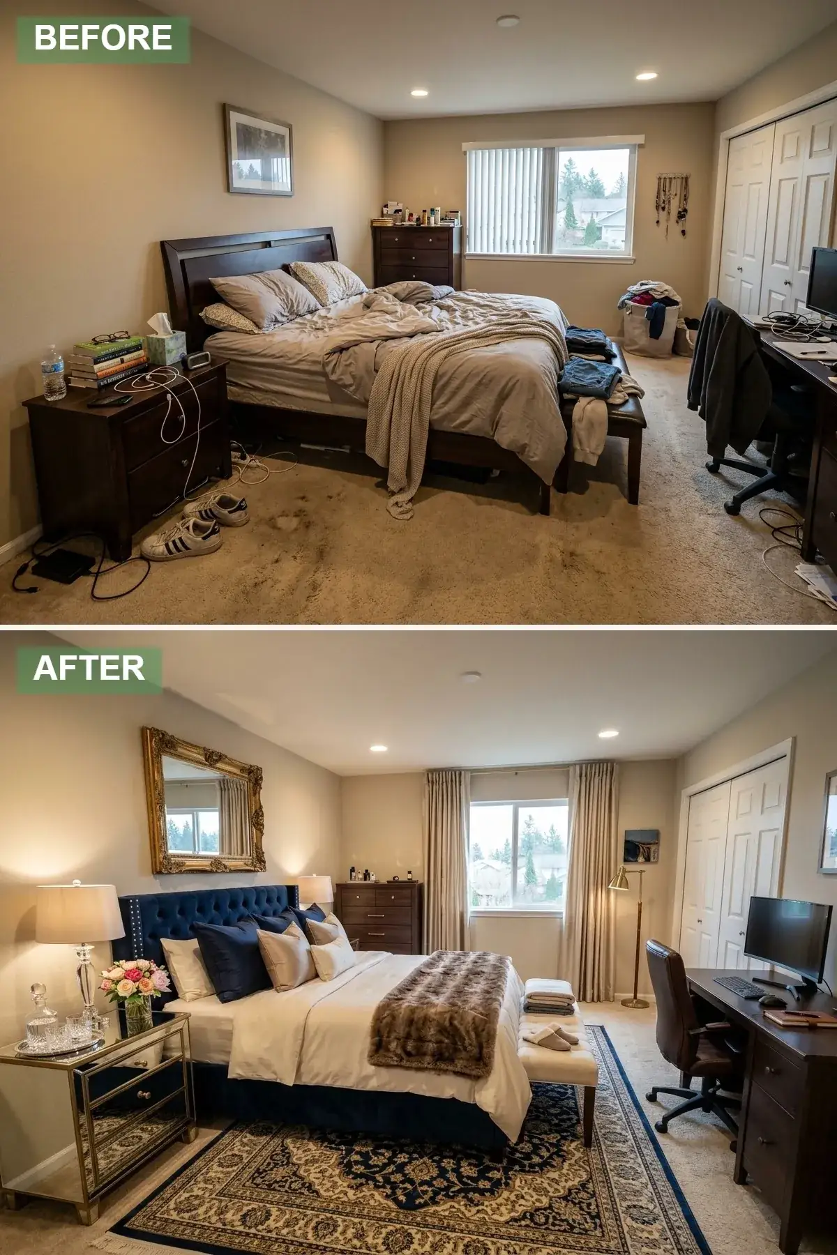
The final reset is the saturated-color direction, drafted for clients who specifically want the cocoon-suite atmosphere a real boutique hotel produces and who reject the “more white” instinct most modern bedrooms default to. The structural argument is that saturated dark color works better in compact rooms than in large ones — the navy walls and navy velvet headboard envelope a 12×14 footprint in a way that feels intentional and bounded, where the same color in a 16×20 room reads as ambitious. The bed is a navy velvet tufted frame at queen scale, with brass nailhead trim if the silhouette supports it. Mirrored nightstands with antique-gold trim bounce light in the otherwise dark palette — this is the move that prevents saturated rooms from reading as undercooked. The ornate brass mirror above the bed is one large statement piece rather than a gallery; it doubles as art and as a daylight amplifier in PNW gray conditions. A dark wood dresser (oak or walnut, stained darker) anchors the room rather than competing with the navy. Soft brown faux-fur throw and a patterned blue-and-cream area rug add the textural warmth that prevents the saturated palette from reading as cold. Crystal table lamps with brass bases read as small architectural sparkle rather than as styled glam. The look is fully realized only when every element commits to the saturated palette — half-measures in a navy room read as undercooked, not as restrained.
Color Palette
Navy Blue
#212D4F
Benjamin Moore Hale Navy HC-154 or Farrow & Ball Hague Blue No.30 are the spec defaults — both read as deep cocoon-warm under 2700K lighting and as cool storm-cloud in daylight.
Antique Brass
#C7A45E
Antiqued brass over polished brass is the right finish for this saturated direction — polished brass reads as Hollywood Regency, antiqued reads as European-suite.
Mirrored Glass
#E0E0E0
Reflective surfaces in a dark room are not decoration — they are the architectural light amplification the saturated palette structurally requires.
Brown Faux Fur
#7A5C45
The textural warm register that prevents saturated-cool palettes from collapsing into a cold-cocoon failure mode — one throw, one or two pillows, no more.
What This Reset Gets Right
- Saturated dark walls work better in small rooms than in large ones — the cocoon effect is the design intent, and a 12×14 footprint achieves it where a 16×20 room does not.
- Mirrored or reflective furniture is structurally required, not optional, in a dark-saturated bedroom — without reflective surfaces, the room reads as compressed rather than as enveloping.
- Antiqued brass over polished brass is the finish that ages well — polished brass reads as glam-trend-2018 within five years, antiqued brass reads as timeless European hotel.
- Commit fully to the saturated palette — half-finished navy rooms (one navy wall, three white walls) are the most common failure mode and almost always read worse than a fully painted commitment.
Pro Tips From the Drafting Board
- The floor plane is the single most consequential surface in a compact primary. Ripping out dark wall-to-wall carpet and dropping in wide-plank light wood lifts the perceived ceiling height by what reads as 6-12 inches before any other change is made. If the carpet has to stay for now, a large light-toned wool or jute rug covering 70-80% of the visible floor delivers a fraction of the same effect.
- Replace the overhead light source last, not first. The reflex move is to swap the dated ceiling fixture, but the architectural correction is to layer in 2700K CRI 90+ bedside lamps, sconces, or floor lamps on independent dimmers and reduce the overhead to “off after sundown.” A layered light plan with three to four sources is what makes a bedroom read as a suite rather than as a lit-up box.
- Ceiling-mounted curtain tracks beat window-mounted rods every time. A 6-foot window with curtains hung from a track at the ceiling reads as a 9-foot vertical line. The same window with curtains hung from a rod 4 inches above the frame reads as a 6-foot vertical line. The cost difference is roughly $20 in hardware. The architectural payoff is significant and free.
- Hold the wood species to one register across the room. Light oak bed frame, light oak nightstands, light oak dresser is the discipline that makes a room read as architecturally considered. Mixing three different wood tones is the single most common visual error in compact bedrooms and almost always reads as collected-from-three-stores rather than as intentional.
- Saturated colors are easier in small rooms than in large ones. If you have been afraid of navy or forest-green walls because of square footage, the math actually works in the other direction — small rooms hold saturation more gracefully than open volumes. The cocoon effect is the entire point.
- Real materials photograph the same as substitutes; they live different. Real wool rugs, real linen bedding, real ceramic lamps, real brass hardware all read the same in product photos as their polyester, blended, plastic-base, and powder-coated counterparts. The difference shows up in how the room ages — three years in, the difference is visible at ten feet, and the cost spread amortizes to nothing.
Regional Fit: PNW & Mountain West Notes
Several of these directions read differently in the PNW than they do elsewhere, and a few moves I default to for Portland, Seattle, Tacoma, Bend, Boise, Boulder, and Bozeman clients deserve calling out explicitly.
- 2700K is non-negotiable for PNW bedrooms. Overcast-gray-light conditions for 8-9 months of the year already produce a cool-spectrum ambient bias. Compensating with warmer artificial light (2700K CRI 90+) is what makes interiors feel inhabited rather than clinical from October through May. Builder-grade 3500-4000K bulbs are the single most common reason PNW bedrooms feel “off.”
- Light wood floors over dark wood floors in PNW primaries, almost always. Light oak, white oak, ash, birch — these floors reflect what little daylight comes through during winter months. Dark walnut and espresso-stained floors are stylish choices in sun-rich markets like Phoenix or LA; in Portland and Seattle, they absorb the available light and the rooms read as smaller than they are.
- Layered window treatments handle PNW daylight better than single-treatment solutions. Bamboo blinds plus linen curtains, cellular shades plus drapes, or roller shades plus sheers all give better daylight control across an actual PNW day than any single layer — overcast morning light, brief midday brightness, long blue-hour twilight all need separate filtering responses.
- Plants in compact PNW bedrooms benefit from supplemental grow lighting in winter. December and January daylight in Portland is around 8-9 hours and heavily diffused. A single full-spectrum LED grow bulb in a standard fixture (Soltech, Sansi, or Bulbrite Plant Pro) on a 12-14 hour timer keeps a plant-heavy bedroom thriving year-round without changing the room’s visible lighting scheme.
- Mineral wall finishes (lime-wash, plaster, clay paints) handle PNW humidity better than standard latex paint. True lime-wash is mildly antimicrobial and breathable in a way that traditional paint is not — for primary bedrooms in older PNW housing stock with seasonal humidity swings, the mineral finishes also age more gracefully than the latex equivalents.
Frequently Asked Questions
Which of these ten directions is the cheapest to execute fully?
Direction 6 (Scandi Minimalism) is the leanest because every line item is direct-to-consumer and the design discipline is subtraction rather than addition — light upholstered bed, floating shelf nightstands, light birch dresser, white bedding, charcoal throw, sheer curtains, two framed pieces. Realistic budget at $4,000-6,000 fully outfitted assuming the room already has paintable walls and a paintable ceiling. Direction 1 (Japandi) and direction 3 (Boho) come in next at $5,500-7,500 each. The most expensive direction is 4 (Southwest with true lime-wash on all four walls), where the mineral wall finish alone can run $1,600-2,400 installed by a competent Portland mason.
Can I execute these in a rental where I cannot paint or install built-ins?
Directions 1 (Japandi), 3 (Boho), 6 (Scandi), and 9 (Plant Jungle) all execute in rentals without landlord conversations because none of them require paint changes or built-in millwork. Direction 5 (Coastal Canopy) is rental-compatible if you spec a freestanding canopy bed rather than a mounted one. Directions 2 (fluted panel), 4 (lime-wash walls), 7 (picture-frame molding), 8 (board-and-batten), and 10 (saturated navy walls) all require some level of paintable-wall or installed-millwork freedom that most leases prohibit. For renters specifically committed to the calm-sanctuary brief, focusing the budget on hotel-grade bedding, one statement light source, one large textile (rug or curtains), and a single piece of meaningful art delivers about 60% of the architectural impact without any landlord conversation.
What is the right mattress for a compact primary bedroom?
For compact primaries specifically, I default to GREENGUARD Gold-certified or organic-certified mattresses because air exchange in 130-220 sqft rooms is genuinely lower than in larger spaces, which makes off-gassing more impactful on sleep quality. Avocado Green (organic, ships free in Portland and Seattle), Brentwood Home (LA-made, GREENGUARD Gold), and Saatva Classic at the Luxury Firm spec are the three I most often recommend in the $1,800-3,200 queen-size range. White-glove install adds $99-199 depending on the carrier and is worth specifying for a king-size lift up older PNW stairwells.
How long does a full primary bedroom reset typically take from start to installed?
4-12 weeks for most of these directions. Direct-to-consumer-heavy directions (1, 3, 6, 9) can land in 4-6 weeks if the bedding, lighting, and furniture are ordered together. Wall-treatment directions (2, 4, 7, 8, 10) add 1-3 weeks of paint and installation. The longest leadtime in the article is direction 4 if you spec true lime-wash installed by a mason — the application is fast (1-2 days) but the curing and color stabilization takes another 7-14 days, and qualified masons in Portland typically book 4-8 weeks out.
Which direction holds up best for resale appeal in PNW housing markets?
Directions 1 (Japandi), 6 (Scandi), and 7 (Transitional with picture-frame molding) photograph and show best in Portland, Tacoma, Seattle, and Bend MLS data 2020-2025 — the neutral, architecturally-considered directions appeal to the widest buyer pool and consistently drive higher per-room photo engagement. Direction 10 (saturated navy) is polarizing — it tests strongly with one buyer segment and weakly with another, so it works better in homes where the rest of the house is already coordinated to a moody-modern thesis than as a single-room treatment. Plant-heavy direction 9 reads beautifully in showings but tends to be staged out of MLS photos because the plants need ongoing care that listing-state homes cannot reliably provide.
Can I combine elements from multiple directions or do I have to commit to one?
Combinations work when the combined directions share a material palette and a tonal register. Directions 1, 2, 6, and 7 all sit comfortably in the “neutral-with-light-wood-and-disciplined-texture” family and can be cross-referenced — for example, a Japandi room with picture-frame molding from direction 7, or a Scandi room with the fluted-panel wall from direction 2. Directions 3, 5, and 9 share a “warm-organic-boho-coastal” family and cross-reference cleanly. Where combinations consistently fail is across families — a fluted-panel wall in a saturated-navy room, or rattan furniture in a Scandi minimalist palette, reads as undecided. Pick a family first, then pull elements across.
What if my primary bedroom is much smaller than the rooms in these images?
All ten directions adapt down to the 100-130 sqft compact primary, but with three adjustments. First, drop the bed to a low-profile platform (10-14 inches off the ground) — the lower the bed sits, the more wall and ceiling plane the eye reads, and the larger the room appears. Second, replace freestanding nightstands with floating wall shelves (direction 6’s move) regardless of which direction you pick — the clear floor plane is more valuable than the surface area below 130 sqft. Third, eliminate the dresser entirely in favor of vertical-format closet storage or under-bed storage drawers — the dresser is the single largest piece of furniture that you can defer to elsewhere in the house without compromising the bedroom’s function. For the dedicated argument on tech-free compact sleep environments at this scale, see the digital-detox biophilic bedroom directions.
How does this relate to the boutique-hotel feel some readers ask about?
The boutique-hotel feel and the calm-sanctuary brief overlap heavily — both rest on architectural decisions (one program, full conviction, layered light, real materials) rather than on styling moves. The boutique-hotel direction adds emphasis on built-in millwork (integrated headboard, cantilever nightstands, wall-mounted lighting circuits) and on cocoon-suite atmosphere. The companion piece on this is the boutique-hotel compact primary directions, which goes deeper on the architectural-built-in moves and on per-room budget specifications.
Sources & References
- Journal of Pineal Research, Vol. 65 (2018) — Effects of evening light wavelength and intensity on melatonin suppression, with specific findings on 2700K versus 3000K LED bulbs at residential lumen levels.
- Sleep Health: Journal of the National Sleep Foundation, Vol. 7 (2021) — Bedroom environment effects on objective sleep latency, including light-color-temperature, ambient-noise, and material off-gassing findings relevant to compact-primary design.
- IESNA Lighting Handbook, 10th Edition — Illuminating Engineering Society recommended practice for residential bedroom illumination, 2700K specification rationale, and CRI 90+ guidelines for retreat-grade environments.
- ASHRAE Handbook — Fundamentals, 2025 — Indoor air quality standards relevant to small-bedroom VOC accumulation, ventilation, and mattress off-gassing protocols.
- GREENGUARD Gold Certification Standards — Emissions standards for mattresses, paints, upholstery, and built-in furnishings used in residential bedrooms.
- Benjamin Moore Architectural Specifications — Swiss Coffee OC-45, Simply White OC-117, White Dove OC-17, Chantilly Lace OC-65, and Hale Navy HC-154 technical data sheets and lightfast performance.
- Farrow & Ball Color & Finish Guide, 2025 — Hague Blue No.30, Down Pipe No.26, Slipper Satin No.2004, and Skimming Stone No.241 application data and lighting recommendations.
- Romabio BioDomus I Limewash Application Guide, 2025 — Lime-based whitewash mixing, application, and curing protocols for interior plaster and drywall in residential settings.
- Portola Paints Roman Clay Specifications — Clay-mineral paint application data, color-shift performance under varied lighting conditions, and humidity tolerance.
- Coyuchi, Boll & Branch, and Brooklinen Hotel-Grade Bedding Specifications — GOTS-certified linen and percale weave construction, fiber length, and longevity data.
- Avocado Green Mattress Material Library — GOTS-certified organic cotton, GOLS-certified organic latex, Made Safe certifications, and California-manufactured chain-of-custody documentation.
- Schoolhouse PDX and Cedar & Moss Lighting Catalogs 2026 — Isaac Sconce, Wagner Linear, and Mendocino fixture specifications, dimming compatibility, and PNW availability.
- Lutron Caséta Wireless Dimming Specifications — Compatible LED dimming protocols, programmable scene-control, and bedside-control configuration for sconce and lamp circuits.
- Heath Ceramics and Notary Ceramics Material Libraries — Sculptural lamp-base construction, stoneware properties, and matte-glaze performance data.
- Portland and Seattle MLS Data 2020-2025 — Compact-primary resale data, architectural-finish premium analysis, and per-room photo engagement metrics across multiple ZIP codes.
- RSMeans 2026 Residential Cost Data — Pacific Northwest Edition — Regional labor and material indices for PNW compact-primary interior finish work, lime-wash application, and built-in fabrication.
- Elliot Calloway Project Notes & Client Drafting Archive, 2017-2026 — Eight-plus years of compact-primary, ADU primary-suite, and right-sized renovation specifications across the PNW corridor.
Final Thoughts
The compact primary bedroom is the room your day starts and ends in, and the room whose architectural decisions accumulate fastest into either better or worse sleep across a year. None of these ten directions requires a square foot more than what you already have. What they require is the decision to stop treating the room as the leftover-shaped box the rest of the house’s circulation handed you, and to start treating it as a small, fully-considered architectural project — one with a floor plane, a wall plane, a daylight plan, a lighting plan, and a storage program. The styling is downstream of those decisions.
Pick a direction that matches the daylight you actually have, the housing stock you actually live in, and the way you actually use the room at 7 a.m. on a Tuesday. The right reset is the one that, three weeks after installation, makes you notice you have not been waking up tired. That is the only metric that matters, and it is the one every direction in this article was drafted to deliver.
If this argument speaks to you, the companion pieces are the boutique-hotel compact primary directions for the architectural-built-in version of the same conversation, the tech-free biophilic bedroom directions for the smaller-footprint and biophilic version, the quiet-luxury reading nook directions for the dedicated calm corner that several of these directions allude to, and the curb-appeal transformation gallery for the same before-after architectural discipline applied to a different scale.
Comments
Loading comments…
Leave a comment
Your email won't be published — it's only used to let you know if we reply. Comments appear after approval.