
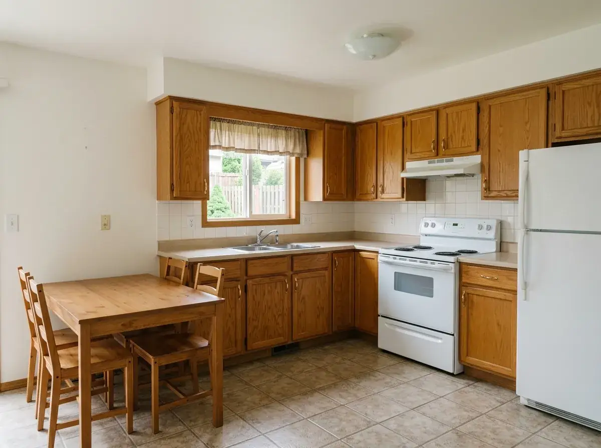

A “cave kitchen” is almost always the same architectural artifact: a 1955-1985 tract galley walled off from the dining room by a load-bearing partition, lit by one yellowed center fixture, finished in oak-soffit cabinetry, beige floor tile, and a laminate countertop that has not aged the way anybody promised it would. The fix is not paint and accessories. The fix is opening the wall, rebuilding the perimeter cabinetry to the ceiling, replacing the floor plane, and committing — fully — to a single design direction across the whole now-merged kitchen-and-dining volume. The twelve transformations below take that same compact open-concept footprint and walk it through twelve complete directions, each one drawn at the level of millwork, material, light, and floor specification an architect would actually draft.
I’m Elliot Calloway — Portland-based architect, eight-plus years on the boards, focused on compact homes, ADUs, and modern under-2,200 sqft plans across the PNW and Mountain West corridor. The compact open-concept kitchen is the renovation my clients ask about most often, because it is almost always the single highest-leverage move in a house built before 1990 — a 220-300 sqft combined kitchen-and-dining volume reconciles a hundred small frustrations into one clear room. The twelve directions below cover the modern grey-and-brass revival, creamy off-white herringbone, mid-century walnut warmth, navy-and-marble luxe, coastal mint, monochrome zen, reclaimed-wood rustic, Scandi minimal, moody black-and-brick, industrial open-shelving, traditional travertine, and retro eclectic ends of the spectrum. Walk through all twelve, then read the FAQs at the bottom for the questions clients ask once they have picked a direction and are ready to scope the work.
What’s in this article
- Elegant Grey and Brass Revival
- Creamy Dream With a Herringbone Twist
- Mid-Century Modern Walnut Warmth
- Luxe Navy and Marble Chevron
- Coastal Cool Mint and Shiplap
- Ultra-Modern Monochrome Zen
- Rustic Stone and Reclaimed Wood Retreat
- Scandi-Minimalist Light Wood and White
- Dramatic Moody Black and Brick
- Industrial Chic With Open Shelving
- Timeless Traditional Elegance
- Retro Eclectic Color Pop
- Pro Tips From the Drafting Board
- Regional Fit: PNW & Mountain West Notes
- Frequently Asked Questions
- Sources & References
- Final Thoughts
Who this article is for
- Owners of 1950s-1980s tract houses with a closed-off galley kitchen who already know they want to take the dividing wall down and now need twelve side-by-side directions before they commit a budget.
- Renovators of compact open-concept kitchens (180-320 sqft combined kitchen-and-dining footprint) who want the architectural reasoning underneath each look, not another mood-board carousel.
- ADU and infill-cottage builders specifying a single combined kitchen-dining-living volume from scratch, choosing a direction before the cabinet order goes in.
- Anyone who has lived with the dark-cabinet, beige-floor, soffit-trapped cave kitchen long enough to know it is not working and now wants twelve fully-resolved directions to weigh against each other.
1. Elegant Grey and Brass Revival
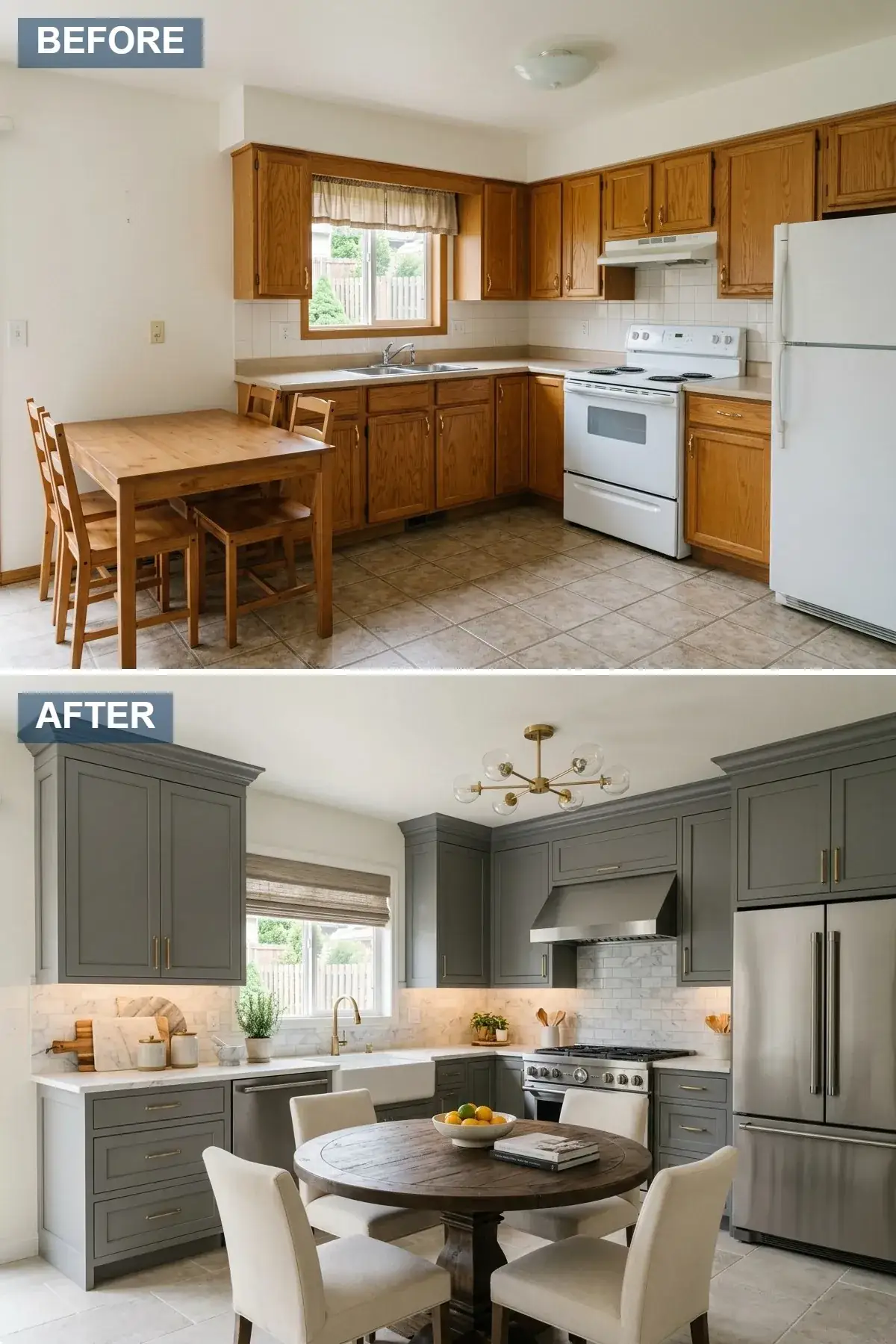
The first direction is the one I draft most often for clients who want a modern result that still reads as architecturally serious rather than as showroom-modern. The decisive move is removing the original soffits above the wall cabinetry and running new shaker-style cabinet boxes to the underside of the ceiling — in a 9-foot-ceiling house this gains roughly 18 vertical inches of usable storage and reframes the whole room as taller than it is. The cabinet door color is a deep charcoal grey spec’d in a low-VOC waterborne acrylic urethane (Benjamin Moore Advance in Kendall Charcoal HC-166 or Sherwin-Williams Emerald Urethane Trim Enamel in Iron Ore SW 7069 are the two finishes I default to for cabinet doors that need to wear hard). The backsplash runs marble subway tile up the full wall behind the range — full-height, no upper-cabinet break — and the countertops are a quiet quartz with subtle veining (Cambria Brittanicca Warm or Caesarstone Calacatta Nuvo are the two specs that read closest to natural stone without the maintenance load). Hardware is solid aged brass in either the Rejuvenation Eastmoreland or Schoolhouse Otto pull line — both manufactured to a tolerance that does not loosen after a year of dishwasher steam. Over the new dining table, a brass sputnik fixture (Rejuvenation Cedar & Moss Mendocino or Schoolhouse Wagner Linear are the PNW-sourced equivalents) anchors the dining half of the merged volume. Floor plane is a large-format porcelain tile in a soft warm grey (24×48 inches or larger; the larger the tile the fewer grout lines, the calmer the plane reads).
Color Palette
Charcoal Grey
#5F6B75
A blue-leaning charcoal that holds up under PNW overcast light without going flat — Benjamin Moore Kendall Charcoal HC-166 is the closest off-the-shelf spec.
Carrara Marble
#E8E8E8
Honed Carrara subway in 3×12 inch format runs the full wall behind the range — not the standard 3×6 — for a more architectural rhythm.
Aged Brass
#CBA135
Solid brass with an unlacquered or gently aged finish — the lacquered versions wear off in two to three years above a dishwasher.
Light Grey Porcelain
#B0B0B0
Large-format 24×48 inch porcelain on a 1/8-inch grout line — fewer lines, calmer plane, easier to maintain than smaller-format tile.
What This Reset Gets Right
- Removing the soffit above the wall cabinets and extending cabinetry to the ceiling is the single highest-leverage millwork move in a 1955-1985 tract kitchen — gains 12-24 inches of storage and reframes the room as taller in one cut.
- Cool charcoal cabinetry plus warm aged brass is the contrast pairing that consistently photographs and lives well in PNW daylight — the warm metal does the work that a saturated wall color would otherwise carry.
- Full-height marble subway behind the range is one of the few backsplash moves that reads as architectural rather than as decorative — stopping the tile at the upper-cabinet line breaks the vertical gesture.
- Large-format porcelain on the floor (24×48 inches or larger) reduces grout line frequency by roughly 60% versus standard 12×24, which is the difference between a floor that reads as a single plane and one that reads as a grid.
2. Creamy Dream With a Herringbone Twist
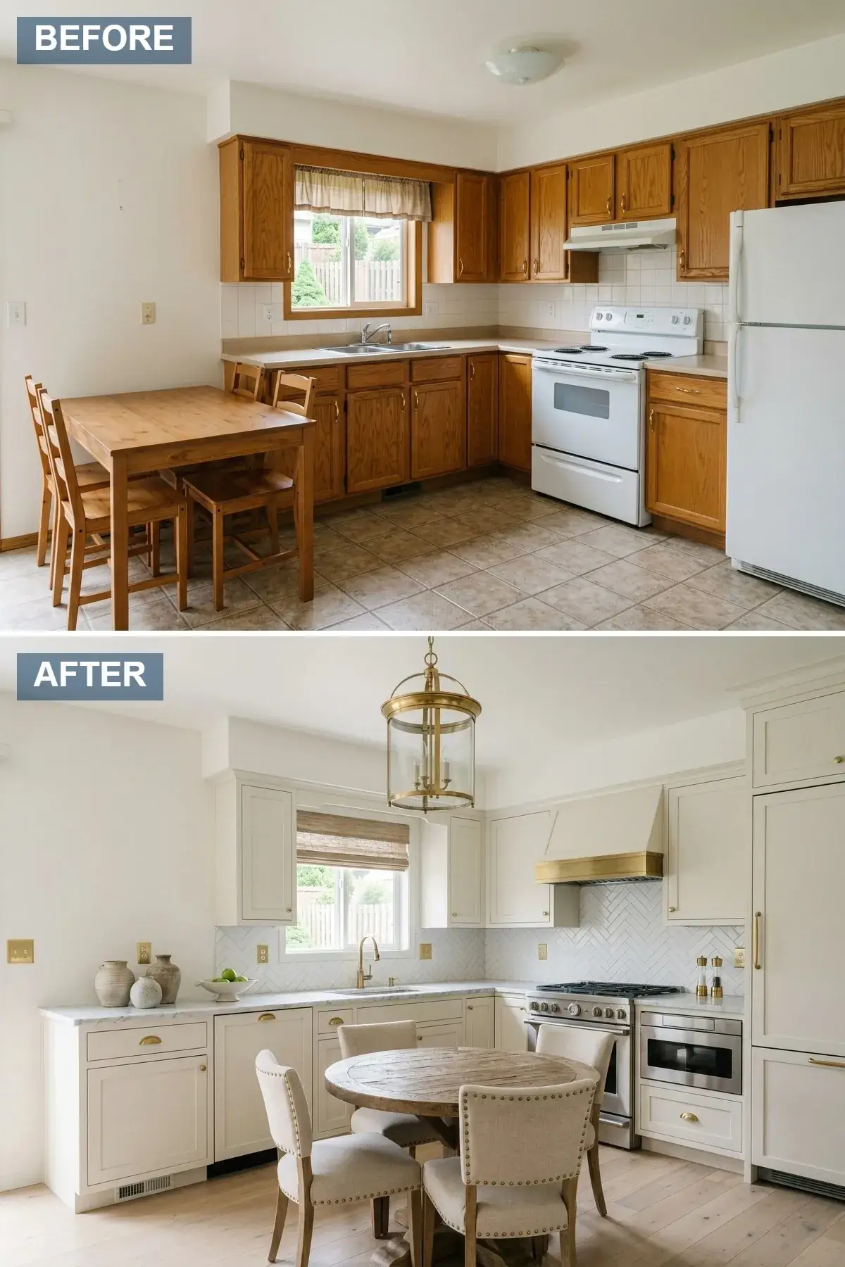
This direction is the warmer, lighter cousin of direction one and the right call for clients whose kitchen sits on the north or east side of the house and needs every available reflected lumen the cabinetry can give back. The cabinet color shifts from charcoal to a creamy off-white — Benjamin Moore White Dove OC-17 is my default because it reads as warm without going yellow, and it photographs honestly in both warm and cool light. The backsplash is the single signature move: a white herringbone marble or porcelain tile running full-height behind the range, with the herringbone angled at 45 degrees rather than the flatter horizontal-bias herringbone, which is the common installation error that makes the pattern read as upholstery rather than as architecture. A custom brass range hood — site-fabricated by a Portland sheet-metal shop in 18-gauge brass over a Best, Zephyr, or Vent-A-Hood liner — becomes the single sculptural object in the room and ties to the brass cabinet hardware and the lantern pendant over the dining table. Light-oak wide-plank flooring (5-7 inch widths, UV-cured matte) replaces the original beige tile and brings the warm wood register back into the room without dropping it back into 1985 oak-cabinet territory. The dining table is a round white-oak pedestal, sized for four daily plus two occasional, which is the right scale for a compact merged kitchen-and-dining volume — square or rectangular tables push the chairs into the kitchen circulation path.
Color Palette
Creamy Off-White
#F2F0EB
Warm white that reads as architectural rather than as builder-grade — Benjamin Moore White Dove OC-17 is my default for warm-leaning rooms.
White Herringbone
#FFFFFF
Honed marble or matte porcelain herringbone, 2×6 inch format, installed at 45 degrees rather than horizontal-bias — the angle is the difference between architectural and decorative.
Polished Brass
#D4AF37
Brass on the hood, the hardware, and the pendant — three locations is the right count, more starts to read as an over-coordinated showroom.
Light Oak Plank
#C8B27B
Wide-plank white oak in 5-7 inch widths, UV-cured matte finish — handles spills and water better than oil-finished oak in a kitchen.
What This Reset Gets Right
- White Dove or Swiss Coffee on the cabinetry photographs honestly across morning, midday, and evening light — many builder-grade whites cool out to a clinical grey by 4 p.m. in PNW conditions.
- Site-fabricated brass range hoods over a major-brand liner cost about the same as a comparable factory Vent-A-Hood and read as one-of-one rather than as catalog — Portland and Seattle both have sheet-metal shops that will fabricate to spec for $1,800-3,400.
- Hold the brass to three locations (hood, hardware, pendant) — a fourth brass register in the same room (faucet, sconce, frame, chair leg) tips into over-coordination.
- UV-cured matte oak handles kitchen-grade traffic better than oiled or wax-finished oak — refinish frequency drops from every 5-7 years to every 12-15.
3. Mid-Century Modern Walnut Warmth
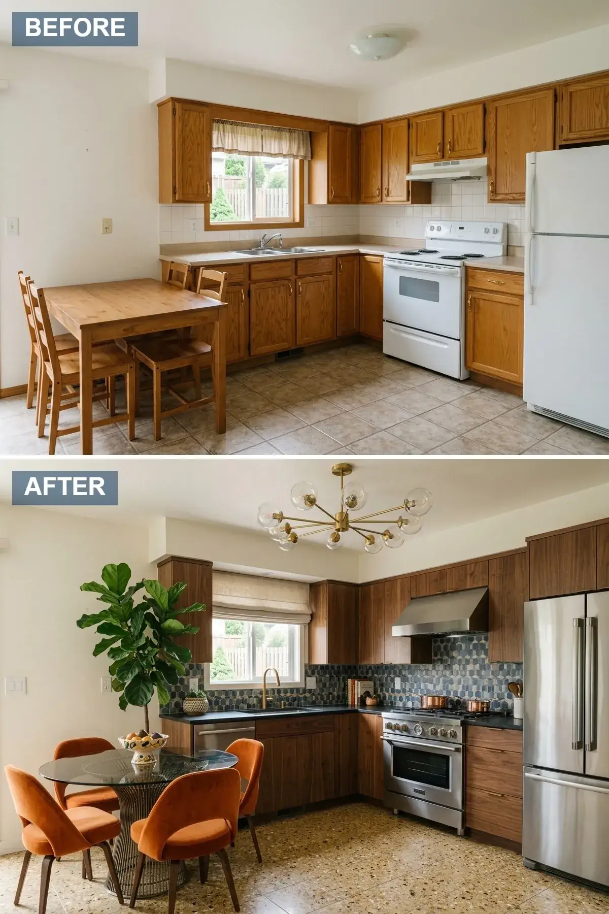
The mid-century walnut direction is the right call for clients who want material warmth without going traditional — walnut is the one wood species that reads simultaneously as architectural, modern, and warm, which is the trifecta most PNW renovations are actually chasing. The cabinetry shifts from shaker to flat-panel walnut veneer with finger-pull or push-to-open hardware (no visible knob or pull); the integrated edge profile is what holds the mid-century read. The backsplash is the single saturated move in the room: a geometric blue ceramic or zellige tile in a hand-crafted register — Clé Tile, Fireclay Tile, and Heath Ceramics all carry hand-formed lines in the deep teal-blue range. The dining set introduces the second material register with a round glass-top table on a sculptural walnut or steel base and burnt-orange velvet upholstered chairs — the orange is the only saturated accent color in the room and it reads as intentional precisely because nothing else competes with it. Terrazzo flooring (real cement terrazzo rather than the porcelain reproduction) brings the multi-tone speckled register that ties walnut, blue, and orange together without any of the three reading as the dominant color. A brass sputnik chandelier — original mid-century if the budget supports vintage sourcing, or one of the better reproductions from Schoolhouse, Cedar & Moss, or Hudson Valley if not — completes the lighting plan over the table.
Color Palette
Walnut Veneer
#795C34
Real walnut veneer over a furniture-grade plywood core — MDF-core walnut sheet goods don’t take handling the way kitchen cabinets need to.
Geometric Blue
#3B5F78
Hand-formed zellige or geometric pattern tile from Clé, Fireclay, or Heath — the irregular edge is what reads as artisan rather than as factory.
Burnt Orange Velvet
#B35A24
The single saturated accent color in the room — works precisely because nothing else competes with it.
Cement Terrazzo
#A8A39D
Real cement terrazzo with mixed marble chip aggregate — the porcelain-print reproduction reads as flat from any distance under five feet.
What This Reset Gets Right
- Flat-panel walnut with integrated finger-pull edges is the mid-century cabinet detail that has not aged out — the same cabinets specified in 1962 read as contemporary in 2026.
- Hand-formed zellige and geometric ceramic tile from artisan lines (Clé, Heath, Fireclay) read as one-of-one because the irregular edges and color variation are real material properties, not factory texture.
- One saturated accent color (the burnt orange) plus walls held to neutral is the mid-century discipline most modern remixes skip — adding a second saturated color flattens the orange into a “playful color scheme” rather than a single bold gesture.
- Real cement terrazzo runs $35-55 per sqft installed in PNW markets and lasts the lifetime of the building — the porcelain print reproduction at $12-18 per sqft does not photograph or live the same way at five feet of distance.
4. Luxe Navy and Marble Chevron
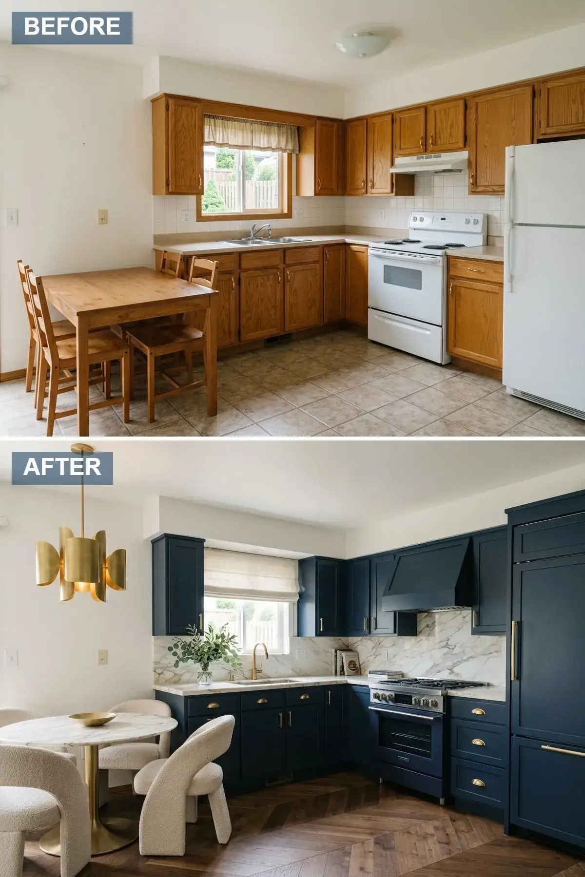
The luxe navy direction is the right call for clients who want depth and quiet drama in the cabinetry without giving up the bright, daylight-filled feel that comes from a continuous stone surface above. The cabinets are navy blue shaker in a furniture-grade waterborne enamel (Benjamin Moore Hale Navy HC-154 or Farrow & Ball Hague Blue No.30 are my two defaults — both hold their pigment under both warm and cool LED light without going purple or grey). Above the cabinets and across the entire backsplash run is a full-height Statuario marble slab — bookmatched rather than tiled — which doubles as the countertop material in a continuous L-shaped wrap. The bookmatched detail is what reads as architectural; tiled marble in this configuration reads as flatter and less luxurious for a similar materials cost. A sculptural brass pendant (the Apparatus Cloud, the Roll & Hill Halo, or the Allied Maker Tilt are the three reference fixtures) hangs over a small marble pedestal dining table with cream boucle dining chairs — the textured boucle is the warm, soft counterweight that prevents the room from reading as cold despite the dark cabinetry. Appliances are panel-ready integrated (refrigerator, dishwasher, and trash compactor all behind cabinet faces) so the run of navy cabinetry reads as one continuous architectural wall rather than as a wall interrupted by appliance fronts. The floor plane shifts to a chevron-pattern white-oak hardwood, which adds movement and elongation to the merged kitchen-and-dining volume — chevron in particular reads the room as wider than its physical width because the V-pattern visually pulls the eye across.
Color Palette
Hale Navy
#1B2F42
Benjamin Moore Hale Navy HC-154 is the navy that holds across both warm and cool LED light without shifting purple — Farrow & Ball Hague Blue No.30 is the alternate spec.
Statuario Marble
#EAEAEA
Bookmatched Statuario slab — not tiled — across the full backsplash and the L-shaped countertop run is what reads as architectural rather than as decorative.
Chevron White Oak
#8C6B46
Solid white-oak chevron parquet, 5-inch leg length, 90-degree apex — the V-pattern visually elongates the room across its narrower dimension.
Cream Boucle
#F5F5DC
Textured boucle in a warm cream — the soft counterweight that prevents the dark cabinetry from reading as cold.
What This Reset Gets Right
- Bookmatched stone slab across the backsplash and the countertop is roughly the same materials cost as tiled marble plus quartz countertop, but reads architecturally distinct — the visual continuity of one stone is the entire luxe argument.
- Panel-ready integrated appliances cost about 30-50% more than their stainless-steel equivalents, and the architectural payoff is significant in a small open-concept kitchen where appliance fronts visually dominate the longest run of cabinetry.
- Chevron white-oak elongates the merged volume across its narrower dimension — for kitchens narrower than 11 feet, chevron consistently reads the room as wider than herringbone or straight-plank installations.
- Cream boucle dining chairs are the warm-soft register that prevents navy-and-marble from reading as cold — black leather or chrome chairs would tip the room into a hospitality-modern direction rather than a residential-luxe one. For the broader argument on stripping visual noise from a kitchen, see the invisible-kitchen design conversation.
5. Coastal Cool Mint and Shiplap
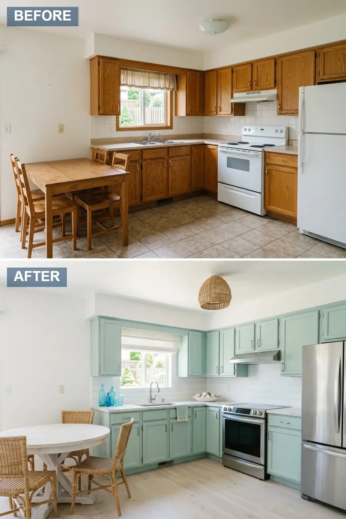
The coastal mint direction reads as PNW-coastal rather than as Hamptons-coastal, which is the calibration that matters for clients in Astoria, Seaside, Bellingham, Port Townsend, and the broader Pacific coastal corridor. The cabinet color is a soft mint green that holds its mineral cast under cool maritime light — Farrow & Ball Pale Powder No.204 and Benjamin Moore Quiet Moments 1563 are the two specs I default to (both go neither blue nor yellow under high-CRI LED at 2700K). The backsplash is vertical or horizontal pre-primed pine shiplap, painted bright white in a satin acrylic enamel — vertical reads slightly taller and is my preference in 8-foot-ceiling rooms. Above the range specifically, I spec a painted-shiplap range backsplash with a stainless-steel splash-guard insert behind the cooktop itself, because shiplap absorbs grease without a barrier and the interruption reads as a designed detail rather than as a maintenance compromise. The dining table is a whitewashed round wood pedestal sized for four to six, paired with woven wicker or rattan dining chairs and a single oversized woven pendant (the Serena & Lily Headlands, the Sika-Design Renoir, or the Made Goods Marisol are the three reference fixtures). Floor plane is whitewashed or pickled oak wide-plank — the whitewash sits on top of the grain rather than dyeing it, which keeps the wood reading as natural rather than as painted.
Color Palette
Soft Mint Green
#A0D8C6
Mineral mint that holds under maritime light — Farrow & Ball Pale Powder No.204 or Benjamin Moore Quiet Moments 1563 are the two defaults.
White Shiplap
#FFFFFF
Pre-primed pine shiplap painted in satin acrylic enamel — installed vertical for taller-reading rooms with 8-foot ceilings.
Natural Wicker
#C4A484
Real woven wicker or rattan rather than the molded-plastic look-alike — the airy openness of the weave is the entire coastal move.
Whitewashed Oak
#D8D3C9
Whitewash sits on top of the grain rather than penetrating it — the wood still reads as wood, not as painted.
What This Reset Gets Right
- Mint green cabinetry in the right mineral spec is one of the few non-neutral cabinet colors that holds well across both daylight and 2700K artificial light — many softer greens shift toward blue or grey as light cools.
- Shiplap as a backsplash material costs roughly $4-7 per sqft installed (against $18-32 per sqft for tile) and reads as a designed coastal detail rather than as a budget substitute when paired with a stainless splash-guard behind the cooktop.
- Real woven wicker chairs cost about 2x the molded-plastic look-alikes and last 8-15 years versus 2-4 — the airy negative space inside the weave is what makes the coastal direction read as breathable rather than as themed.
- Whitewashed oak rather than fully painted oak keeps the floor reading as a natural material — painted floors in a kitchen show wear at the cabinet toe-kicks within 12-18 months and read as worn rather than as patinated.
6. Ultra-Modern Monochrome Zen
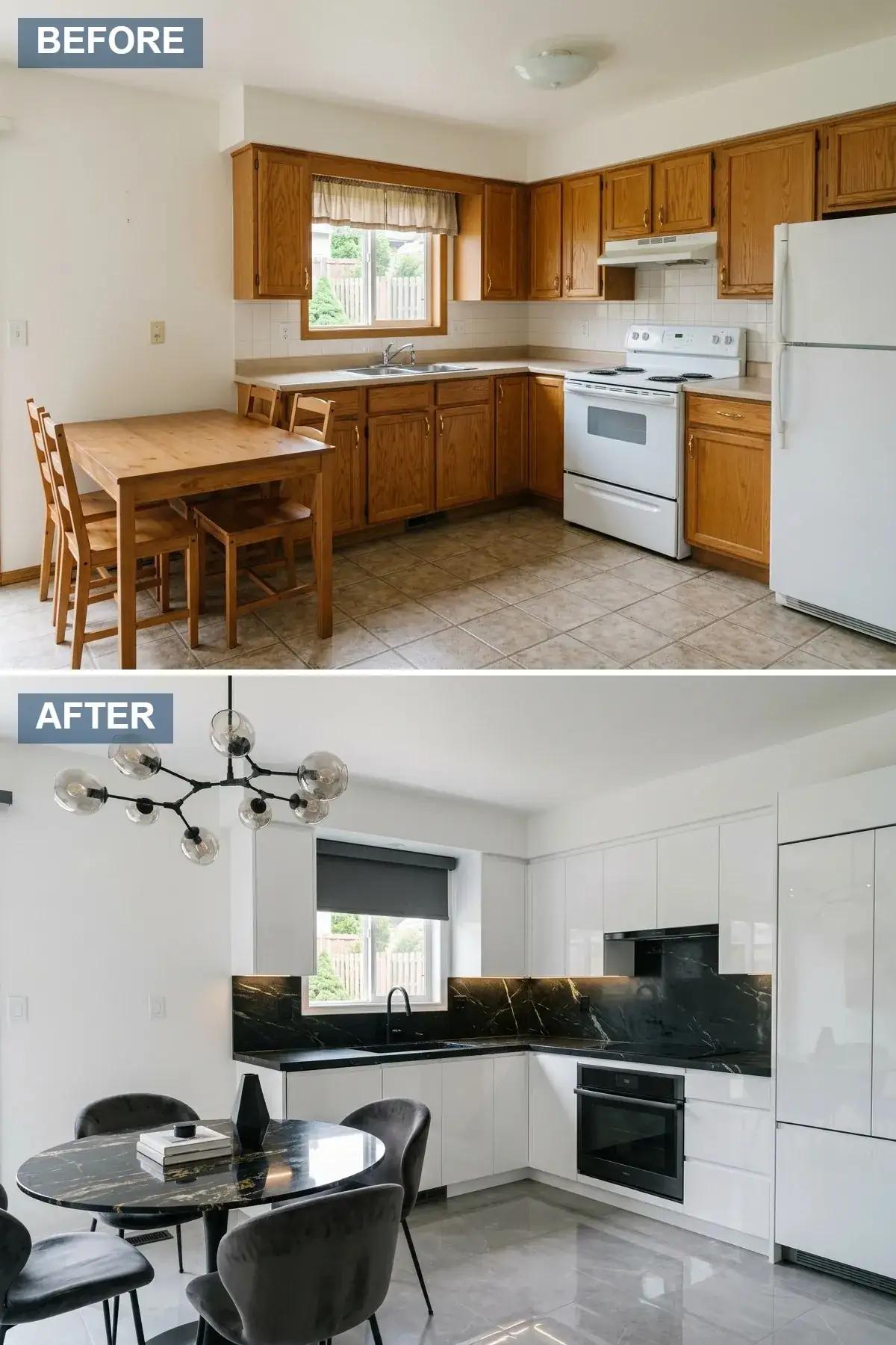
The monochrome zen direction is the right call for clients who want the room to read as one continuous architectural object rather than as a collection of cabinet runs and appliances. Cabinetry is high-gloss white slab with touch-to-open or push-latch hardware (no visible knobs or pulls anywhere in the room) — the German lines (Leicht, Bulthaup, Poggenpohl) and Italian lines (Boffi, Valcucine) are the reference quality, with closer-priced North American equivalents from Henrybuilt (Seattle) and Bilotta. The countertop and full-height backsplash are a single bookmatched black marble slab with dramatic white veining — Nero Marquina, Sahara Noir, or Black Beauty are the three slabs that consistently photograph the way the brief intends. The dining table is a round black marble pedestal with charcoal velvet upholstered chairs on a low base, all sitting on a large-format polished grey porcelain tile floor (48×48 or larger). The lighting plan deliberately rejects the decorative pendant in favor of a linear architectural fixture — the Vibia Suite, the Apparatus Tassel, or the FLOS Light Shadow — which reads as part of the architecture rather than as a hung decorative object. The discipline of this direction is subtraction: nothing on the counters except a single object (a fruit bowl, a kettle, a stack of two cookbooks), no hardware, no visible appliances, no upper-cabinet uppers in the lighter wall plane. The result is a room that reads as a piece of architecture, not as a kitchen.
Color Palette
High-Gloss White
#FFFFFF
Polyurethane or acrylic high-gloss laminate slab fronts — the German and Italian lines run furniture-grade and hold their finish; the budget high-gloss reads as plastic within two years.
Nero Marquina Marble
#1A1A1A
Bookmatched black marble slab — Nero Marquina, Sahara Noir, or Black Beauty are the three references for the dramatic vein-on-black look.
Charcoal Velvet
#4A4A4A
Soft velvet in a warm-leaning charcoal — the soft texture is what holds the monochrome from reading as cold.
Polished Grey Porcelain
#808080
Large-format 48×48 inch polished porcelain — the high-shine surface reflects the high-gloss cabinetry and reads the floor as continuous with the lower cabinet plane.
What This Reset Gets Right
- Touch-to-open or push-latch hardware on slab cabinetry is the architectural detail that pulls the entire room out of “kitchen” and into “wall plane” — visible knobs and pulls are the single move that breaks the discipline.
- Bookmatched black marble against high-gloss white is the highest-contrast pairing in the article — for clients who want drama, this is the cleanest way to deliver it without saturated color.
- Architectural linear lighting (Vibia, Apparatus, FLOS) replaces the decorative pendant and reads as built-in rather than as added — the entire room benefits from the same subtraction discipline as the cabinet hardware.
- This direction asks more of the client than any other in the article: the discipline of empty counters has to be lived, not just installed. If the household cannot maintain visual minimalism in a real way, direction 1 or 4 lands closer to the brief.
7. Rustic Stone and Reclaimed Wood Retreat
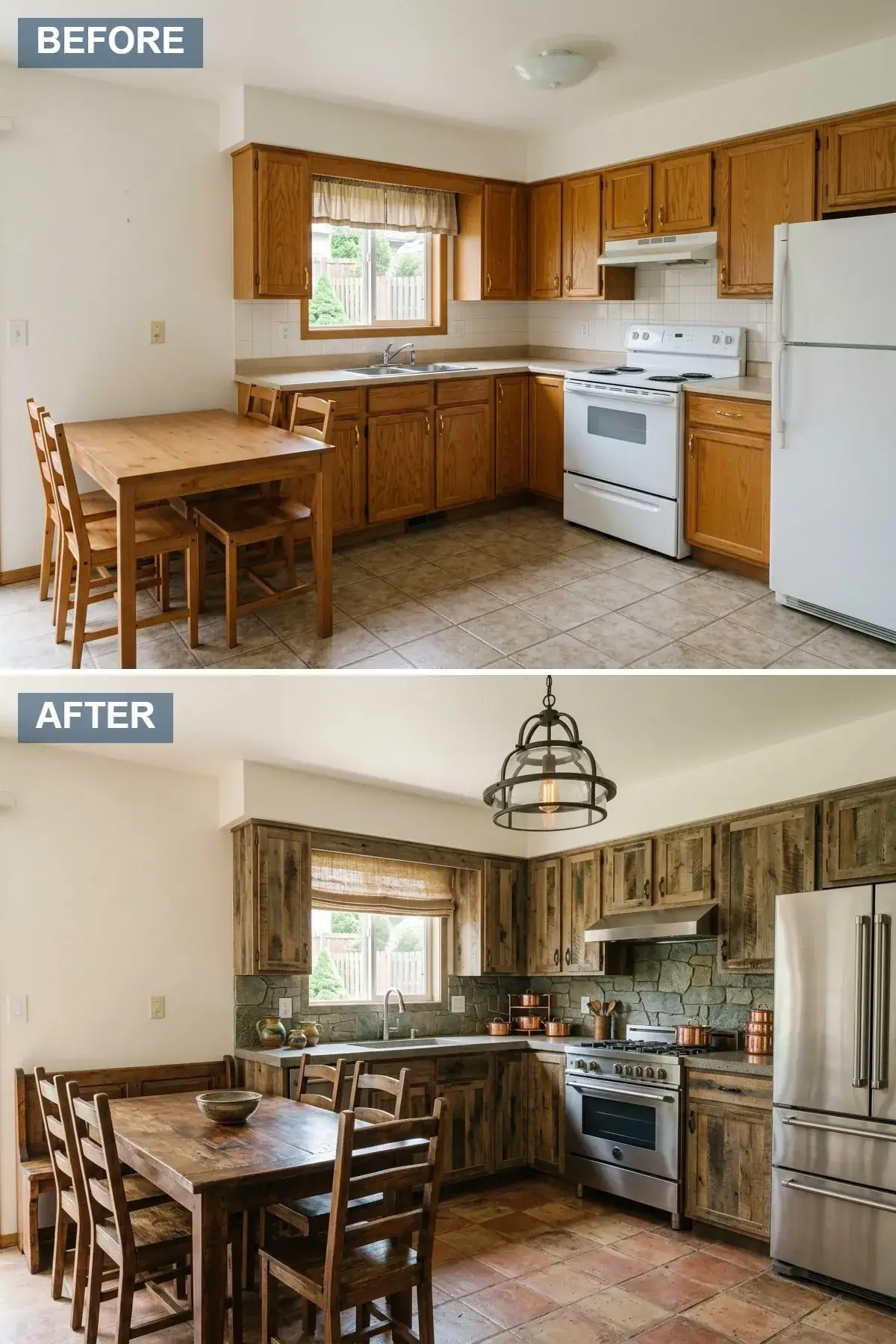
The rustic stone direction is the right call for clients in Bend, Hood River, Sandpoint, Bozeman, and the broader Mountain West cabin-and-lodge corridor — the materials read as architecturally honest in those climates because the building stock and the surrounding landscape both already speak the same vocabulary. Cabinetry is genuine reclaimed barn wood or salvaged Douglas fir milled into shaker fronts over plywood boxes (the boxes themselves should be new, sealed, and engineered for kitchen-grade humidity — only the fronts and exposed end panels are salvage). The backsplash runs real stacked stone or quarry-cut ledgestone behind the range — full-height to the ceiling, set in mortar rather than stuck-on adhesive panels (the adhesive ledgestone reads as flat in person within a year of installation). Countertops are integrally pigmented polished concrete poured in place by a Portland or Seattle concrete fabricator (Concreteworks, Solidthought Studio, or Phillips Construction Cast Stone are the three references), which gives the slight color and aggregate variation that pre-cast slab simply cannot. Dining is a solid sawn-edge or live-edge wood table with a matching bench on one side and four chairs on the other — the bench geometry is the right call for compact rooms because it eliminates the chair-pulled-out circulation cost of a full set. Lighting is a single wrought iron multi-bulb pendant over the table; flooring is terracotta tile in 12×12 or 16×16 inch format, sealed with a penetrating sealer rather than a topical wax. For clients who want the same warm-natural argument applied to the living-room half of the open plan, the companion piece is the biophilic living-room directions.
Color Palette
Reclaimed Barn Wood
#6B543E
Genuine salvage on the door fronts and exposed end panels only — boxes should be new, sealed, kitchen-grade plywood for moisture stability.
Stacked Ledgestone
#8A8A80
Real quarry-cut stone set in mortar — the adhesive-panel imitation reads as flat within 12 months and never gains the depth of true stacked stone.
Polished Concrete
#999999
Integrally pigmented and poured in place by a regional fabricator — the color and aggregate variation is what pre-cast slab cannot replicate.
Terracotta Tile
#A86540
Unglazed terracotta sealed with a penetrating sealer — topical wax sealers wear off in high-traffic kitchen zones within 3-5 years.
What This Reset Gets Right
- Reclaimed wood on the door fronts only — not on the cabinet boxes — is the engineering compromise that makes the rustic direction live well in a humid kitchen environment without compromising the visual argument.
- Real stacked ledgestone in mortar reads as architectural depth at any distance; the stuck-on adhesive panel imitation reads as flat within a year and never recovers.
- Poured-in-place polished concrete countertops cost roughly $80-130 per sqft installed in PNW markets — about 1.5x quartz, but the material reads as one-of-one and the integral pigment ages gracefully.
- The dining bench plus four chairs configuration saves roughly 18-24 inches of circulation against a full chair set — the right move for compact merged kitchen-and-dining volumes under 280 sqft.
8. Scandi-Minimalist Light Wood and White
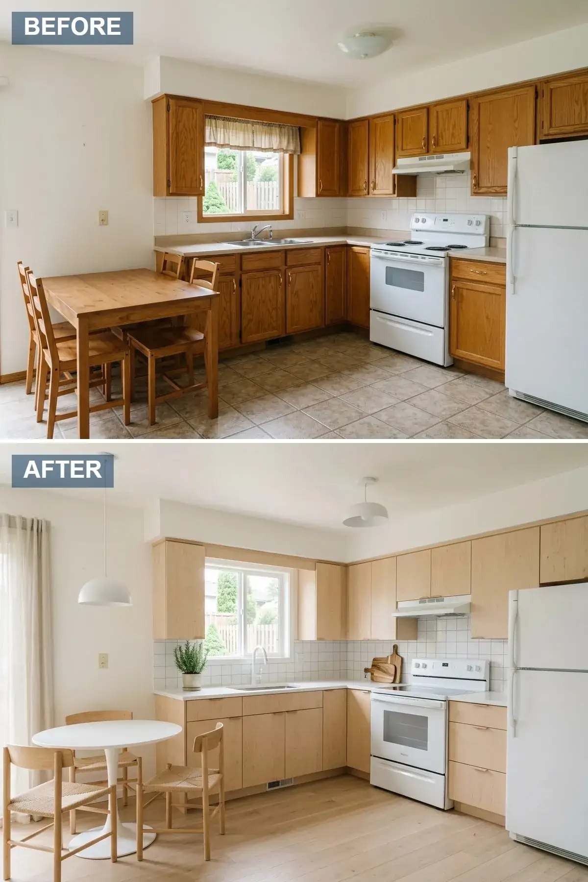
The Scandi direction is the leanest, lightest, and most discipline-rewarding of the twelve — it is also the one I draft most often for ADUs and infill cottages where every square foot earns its keep and visual noise has to be kept to a minimum. Cabinetry is flat-panel light birch or pale ash veneer with the same finger-pull or push-to-open hardware as the monochrome direction (no visible pulls). The backsplash is the simplest move in the article: a plain white 4×4 square tile in a stack-bond rather than running-bond layout, which reads as more contemporary and less subway-traditional. Appliances are integrated where budget allows, or specified in matte white rather than stainless steel — the Smeg matte white line, the Big Chill collection, and Bertazzoni Heritage all carry true matte-white kitchen-grade appliances that ship without the showroom-yellow undertone the budget appliances develop. The dining set is a white tulip table (Knoll original or a faithful reproduction) with natural-fiber woven side chairs in a paper-cord or cane weave. Pendants are simple white opal-glass globes on a steel or aluminum stem (the Schoolhouse Otto, the Cedar & Moss Beacon, or the Gubi Multi-Lite). Flooring is pale oak wide-plank in a UV-cured matte finish — the same plane as direction 2 but in a slightly cooler tonal register. The result is a room that reads as architecturally calm rather than as styled, which is the entire Scandi argument.
Color Palette
Light Birch Veneer
#E3CFAE
Pale birch or ash veneer over plywood — the cool-warm balance of birch handles PNW grey light better than warmer maple or bamboo.
White Square Tile
#FFFFFF
Plain 4×4 square tile in a stack-bond layout — reads contemporary rather than subway-traditional, and is a third the cost of patterned tile.
White Tulip
#FAFAFA
Knoll Saarinen tulip table in white — the original holds up against any reproduction and amortizes as furniture, not as an object you replace.
Pale Oak Plank
#DDC8A6
Pale oak in a 5-inch UV-cured matte plank — the floor plane that the cabinetry reads continuously off of.
What This Reset Gets Right
- The Scandi direction is the cheapest of the twelve to execute fully because the discipline is subtraction — fewer materials, fewer finishes, fewer light fixtures. Realistic budget runs $24,000-38,000 for a 220 sqft compact open-concept kitchen in Portland markets.
- Stack-bond white square tile is the most undersold backsplash spec in the article — costs $4-9 per sqft installed and reads as more contemporary than any subway-bond white tile at three times the materials cost.
- True matte-white appliances (Smeg, Bertazzoni Heritage, Big Chill) hold their finish under both warm and cool light without the yellow undertone that develops in budget white appliances within 18 months.
- Original Knoll Saarinen tulip tables in white amortize across decades as furniture — the reproductions cost a quarter as much and require replacement within 5-7 years of daily use.
9. Dramatic Moody Black and Brick
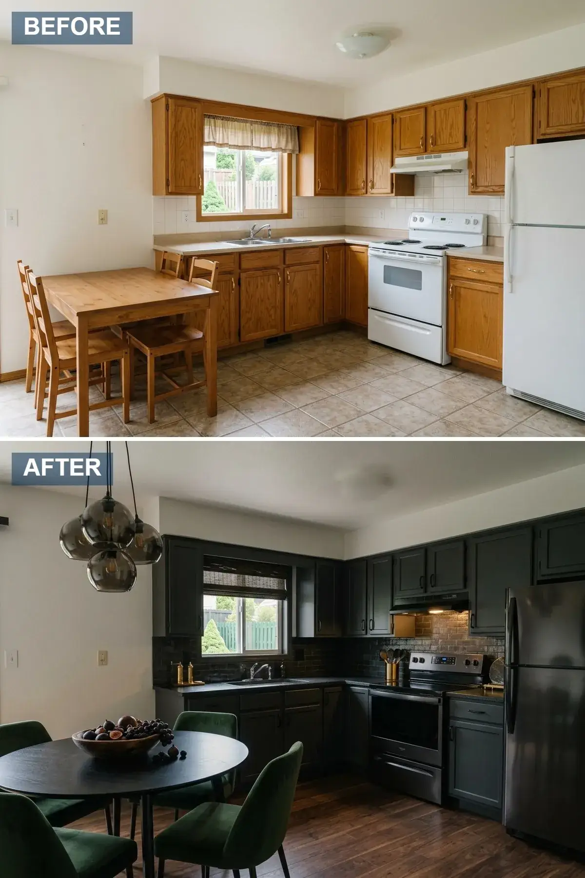
The moody black direction is the right call for clients with strong daylight and high ceilings who want a cocoon-suite atmosphere in the kitchen rather than the bright-and-airy default. Cabinetry is matte black shaker in a low-VOC waterborne acrylic urethane (Benjamin Moore Black HC-190 or Sherwin-Williams Tricorn Black SW 6258 in the Emerald Urethane Trim Enamel formulation are the two specs that hold up to kitchen-grade wear). The backsplash is real exposed brick — either uncovered original brick where the house has it, or a thin-cut clay brick veneer (Glen-Gery, Old Mill Brick, Brickwebb) installed over cement board and grouted with a contrasting mortar. Black stainless-steel appliances (LG Black Stainless Steel, KitchenAid Black Stainless, or paneled to match cabinetry) keep the appliance plane reading continuously with the cabinetry. The dining table is a round black-painted oak or matte black metal pedestal with forest green velvet chairs — the green is the single saturated accent color in the room, and it reads as jewel-toned rather than as primary because it sits against black rather than against white. Smoked glass pendant lights over the table cast warm amber-toned light onto the surface below — Schoolhouse, Cedar & Moss, and Lambert & Fils all carry smoked-glass globes in the right register. Flooring is dark walnut wide-plank hardwood, which closes the room visually downward and is what makes the cocoon-suite feeling actually work.
Color Palette
Matte Black
#2C2C2C
Benjamin Moore Black HC-190 or SW Tricorn Black SW 6258 in furniture-grade waterborne enamel — both hold against kitchen wear without going chalky.
Dark Exposed Brick
#4A3C31
Real brick in original or thin-cut veneer — the texture and color variation is what drives the entire moody read.
Forest Green Velvet
#224231
Jewel-toned forest green — reads as one luxurious accent precisely because it sits against black rather than against white.
Dark Walnut Plank
#4A3225
Dark walnut wide-plank — closes the room visually downward and is what makes the cocoon-suite atmosphere actually land.
What This Reset Gets Right
- Moody dark cabinetry needs strong daylight to live well — the direction is correct only for kitchens with at least 12-15 sqft of glazing per 100 sqft of floor area, and benefits from a south or west exposure.
- Real exposed brick or thin-cut clay veneer reads architecturally honest at every distance; the printed brick wallpaper reads as printed even from across the room and never recovers.
- Forest green against black is one of the few jewel-toned accents that does not read as 1990s-revival — the calibration is the velvet texture plus the matte black field, both of which absorb light rather than reflect it.
- Layered lighting is non-negotiable in this direction — under-cabinet LED strips at 2700K, two pendants over the dining table, and at minimum two recessed cans over the working countertop. Without the layered light plan, the room reads as too dark to actually cook in.
10. Industrial Chic With Open Shelving
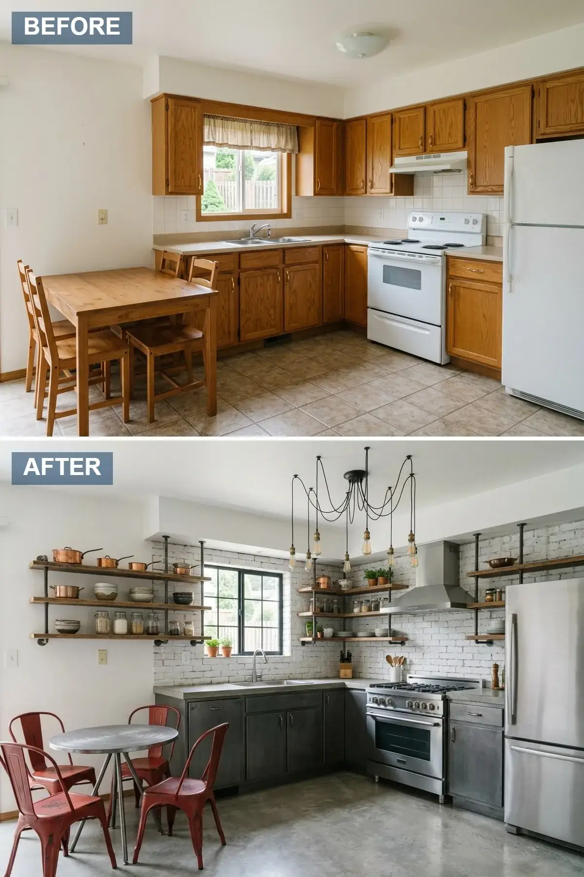
The industrial direction is the right call for converted lofts, repurposed warehouse spaces, and the small but growing category of new-build PNW infill homes deliberately drafted to read as industrial. Upper cabinets get removed entirely and replaced with open wood shelving on black iron pipe brackets against a white-painted brick wall — the visual openness this delivers in a compact kitchen is the entire structural argument. Lower cabinetry is distressed metal or zinc-faced shaker over plywood boxes (Henrybuilt, Crystal Cabinet Works custom, or specified through a local PNW cabinet fabricator). Countertops are polished concrete in a slightly cooler grey than direction 7 — the industrial direction wants the concrete to read as utilitarian rather than as warm. Appliances are commercial-style — a 36-inch BlueStar, Wolf, or Thermador range with a matching hood, paired with a counter-depth refrigerator in stainless steel. The dining set is a metal industrial table (powder-coated steel or zinc-topped wood) with Tolix-style metal chairs. Lighting is the single decorative concession: an exposed multi-bulb chandelier in black or brass with vintage Edison-style LED bulbs at 2700K. Flooring is polished concrete matching the countertops, sealed with a penetrating concrete sealer rather than an epoxy topcoat (the epoxy yellows under UV within 5-7 years and has to be re-coated).
Color Palette
White Painted Brick
#F0F0F0
Original brick painted with a mineral lime-based paint or Romabio Masonry Flat — these breathe and let the brick texture telegraph through the paint layer, where standard latex flattens it.
Distressed Metal
#555555
Zinc-faced or distressed-steel shaker fronts over plywood boxes — real metal patinas with use rather than chips like painted finishes.
Polished Concrete
#9E9E9E
Polished concrete matching the floor — sealed with a penetrating sealer, never with an epoxy topcoat that yellows under UV.
Black Iron Pipe
#1F1F1F
Schedule-40 black iron pipe brackets — overspec the diameter (3/4-inch or 1-inch rather than 1/2-inch) for kitchen-grade load and visual weight.
What This Reset Gets Right
- Removing upper cabinets entirely in favor of open shelving is the most divisive move in the article — it gains roughly 25-35% of the visual openness of the room and loses roughly 15-20% of the storage capacity. Households that already own less than the average kitchen inventory benefit; households that store more should keep one upper cabinet run on the less-visible wall.
- Real distressed-metal cabinet fronts patina gracefully with use; painted-metal-look finishes chip at every drawer pull within 18 months and never recover the intended look.
- Polished concrete on both the countertop and the floor in the same finish reads the room as continuous from horizontal plane to horizontal plane — the visual continuity is what the industrial direction is actually selling.
- Penetrating concrete sealers (Prosoco LSKS, Ghostshield Siloxa-Tek 8505, ChemMasters Polyseal WB) handle PNW kitchen humidity and water exposure better than topical epoxy or wax — and they don’t yellow.
11. Timeless Traditional Elegance
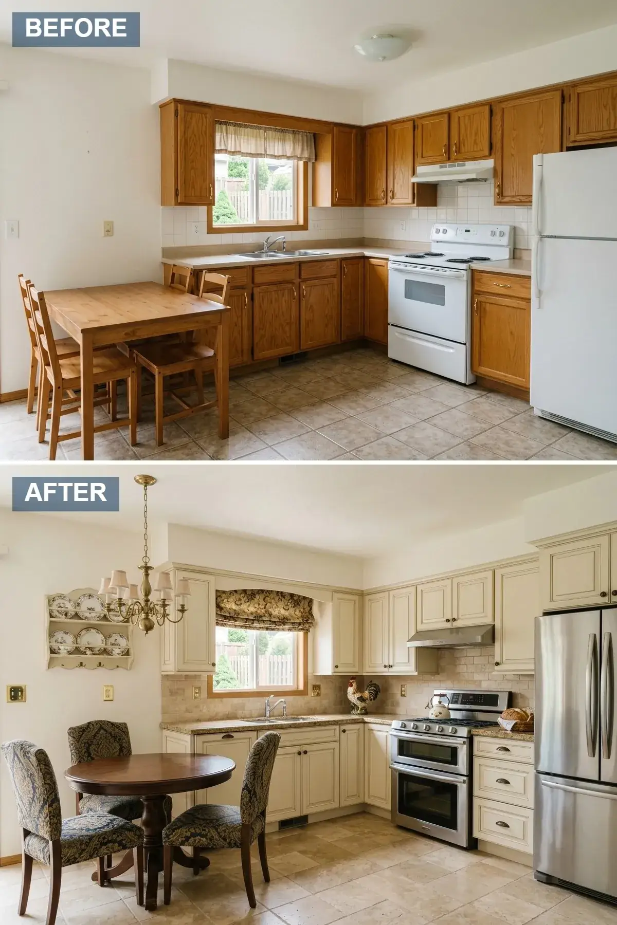
The traditional direction is the right call for clients in PNW and Mountain West neighborhoods where the architecture itself reads as historical — Portland’s Eastmoreland and Irvington, Seattle’s Capitol Hill and Madison Park, Boise’s North End, Bend’s older downtown — and where the kitchen renovation needs to read as belonging to the house rather than as a contemporary insertion. Cabinetry is raised-panel glazed shaker in a creamy off-white with a soft glaze in the panel reveals (Crystal Cabinet Works, Wood-Mode, and KraftMaid all carry production glazed lines that read close to custom). The backsplash is beige travertine subway — honed rather than polished, full-height behind the range — and the countertops are speckled granite in a warm brown-and-cream colorway (the polished granites of the early 2000s have been reframed by 2026 as classic rather than as dated, which is the right read for a traditional kitchen). The dining table is a dark walnut or cherry pedestal with upholstered chairs in a classic paisley or damask pattern — the upholstered fabric is what gives the dining set its formality. Above the table, a brass-and-shaded chandelier (Visual Comfort, Hudson Valley, or Currey & Company) with cream linen drum shades casts soft directional light. Flooring is travertine pavers matching the backsplash material, in 18×18 or 24×24 inch format — the two travertine planes (wall and floor) tie the room together and read as architecturally cohesive.
Color Palette
Cream Glazed
#F2E8D5
Raised-panel cabinets in a warm cream with hand-applied glaze in the panel reveals — the glaze is what reads as traditional millwork rather than as contemporary painted shaker.
Travertine Tile
#DDCBA4
Honed travertine on both the backsplash and the floor — the same material on both planes ties the room together architecturally.
Paisley Pattern
#3E4A59
Classic paisley or damask in deep blue and gold — the patterned upholstery is what gives the dining set its formality.
Travertine Pavers
#CDBFA3
18×18 or 24×24 inch travertine pavers — sealed with a penetrating sealer to handle kitchen-grade water exposure.
What This Reset Gets Right
- Raised-panel glazed cabinetry is the single detail that pulls a traditional kitchen out of “builder grade” and into “considered millwork” — the glazing is the labor-intensive step the production lines all do at a price premium worth paying.
- The same travertine on the backsplash and the floor is the architectural move that makes the traditional direction read as integrated rather than as a sum of catalog parts.
- Speckled granite countertops were the default of the early 2000s and were briefly considered dated by 2015-2020, but as quartz has saturated the market, real granite has been reframed as classic and material-honest. For traditional kitchens specifically, granite reads correctly in a way that quartz does not.
- Brass-and-shaded chandeliers from Visual Comfort, Hudson Valley, or Currey & Company are the dining-table light register that ties the traditional direction together — exposed-bulb fixtures from any line read as too contemporary for the brief.
12. Retro Eclectic Color Pop
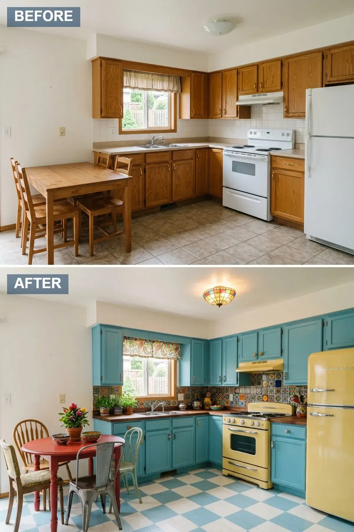
The retro eclectic direction is the most polarizing in the article — it tests strongly with one buyer segment and weakly with another, and it is the right call only for clients whose entire house reads as a coordinated retro-eclectic argument rather than as a contemporary house with a single bold kitchen. Cabinetry is turquoise shaker in a satin acrylic enamel (Benjamin Moore Tropicana Cabana 657 or Behr Glistening Pool MQ4-49 are the two reference colors). The backsplash is the room’s loudest move: a handmade Mexican Talavera tile in a colorful patterned register (sourced through Casa Talavera, Mexican Tile Designs, or — for the more architecturally-considered version — a custom installation by a local Portland tile artist working with imported blanks). Appliances are vintage-style retro Smeg, Big Chill, or Northstar in a saturated yellow, including the refrigerator, the range, and the dishwasher panel. Dining is a red lacquered round table with four mismatched chairs in different saturated colors — the mismatch is the point, and sourcing them as a coordinated set defeats the entire eclectic argument. Lighting is a colorful stained glass ceiling fixture over the table — vintage-sourced where possible, or commissioned from a Portland glass artist working in a mid-century or art-deco register. Flooring is the blue-and-white checkered linoleum (real linoleum from Forbo Marmoleum, not vinyl) that completes the retro read. A 1.5x to 2x markup over the more restrained directions is realistic because the materials sourcing alone is more time-intensive — but the result is a one-of-one room with no equivalent.
Color Palette
Bright Turquoise
#40B4C8
Saturated turquoise in satin acrylic enamel — Benjamin Moore Tropicana Cabana 657 holds its chroma without going chalky over time.
Retro Yellow
#F2D871
Smeg, Big Chill, or Northstar in a vintage yellow — the saturated appliance fronts are the room’s anchoring move.
Mexican Talavera
#C85A28
Hand-painted Talavera tile from a real Mexican production line — the irregularity and color variation are what read as artisan rather than as printed.
Blue & White Checker
#FFFFFF
Real Forbo Marmoleum linoleum in a custom-cut checker layout — vinyl reproductions read as flat at every distance under five feet.
What This Reset Gets Right
- The retro eclectic direction is correct only when the entire house reads as coordinated to the same retro-eclectic argument — a turquoise-and-yellow kitchen in an otherwise contemporary white house reads as undecided rather than as bold.
- Real hand-painted Mexican Talavera (sourced from Puebla or via reputable importers) costs $18-32 per sqft installed and reads as artisan; the printed Talavera-look porcelain at $6-12 per sqft reads as printed at any distance.
- Sourcing four mismatched dining chairs from four different sources (one estate sale, one Etsy vintage seller, one independent Portland furniture maker, one big-box) is the discipline that delivers the eclectic read — buying a “mismatched” four-chair set from a single retailer always reads as a coordinated set.
- Real linoleum (Forbo Marmoleum) lasts 25-40 years in a kitchen and is the only material that delivers the retro checker read with the durability the kitchen actually requires — vinyl reproductions wear at the cabinet toe-kicks within 5-7 years.
Pro Tips From the Drafting Board
- The wall comes down before any other decision matters. If the dividing partition is non-load-bearing, demolition runs $400-900. If it is load-bearing, an engineered LVL or steel beam header runs $4,200-9,800 in PNW markets including the structural engineer’s stamp, the permit, and the install. Either way, opening the wall is the move that makes every direction in this article actually work — none of the twelve land in a closed-off galley, no matter the cabinetry.
- Layer the lighting plan in three separate circuits. Under-cabinet LED strips at 2700K CRI 90+ on one switch, recessed cans at the ceiling on a second switch, and pendants over the dining table on a third. Without three independent circuits, the room reads as either too bright or too dim across the entire day. Lutron Caséta or Leviton Decora Smart wireless dimmers are the spec I default to because they retrofit into existing electrical boxes without re-running romex.
- Soffit removal is the single most common scope-creep item. When you take down the soffit above the wall cabinets, you almost always find unexpected: ductwork, plumbing, or original electrical that needs to be re-routed. Budget $1,800-4,500 in mechanical re-routing on top of the cabinet replacement cost, and confirm with a contractor walking through with a stud-finder and an infrared scanner before you commit the cabinet order.
- Range hood specification matters more than range specification in compact open-concept kitchens. The kitchen now shares an air volume with the dining and often the living room — undersized hoods (under 600 CFM) leave cooking smell in the upholstery within months. The two specs that consistently work for compact open-concept kitchens are 600-900 CFM at the cooktop with a make-up air kit (required by code in most PNW jurisdictions above 400 CFM) and a range with sealed burners that reduce particulate generation in the first place.
- The floor plane runs continuous from kitchen into dining for a reason. Visually, two different floor materials at the kitchen-dining boundary read the room as two rooms even after the dividing wall is gone — the architectural payoff of opening the wall is partially undone. Either run the kitchen flooring through the dining (large-format porcelain, terrazzo, polished concrete all work) or run the dining flooring through the kitchen (oak, walnut, ash all work with appropriate sealing). Splitting the materials is the single most common visual error in compact open-concept renovations.
- Cabinet hardware is the cheapest finish-quality lever. Upgrading from $4-each builder-grade pulls to $14-22-each solid brass, bronze, or steel pulls runs about $400-800 across a full kitchen and is the single highest finish-impact-per-dollar move. Specify pulls with center-to-center bores at 96mm or 128mm rather than the 76mm builder-grade default — the longer pulls read as proportional to ceiling-height cabinetry where the short pulls always look undersized.
Regional Fit: PNW & Mountain West Notes
Several of these directions read differently in the PNW and Mountain West than they do in sun-rich Sun Belt or East Coast traditional markets. A few moves I default to for Portland, Seattle, Tacoma, Bend, Eugene, Boise, Boulder, and Bozeman clients are worth calling out explicitly.
- 2700K is the right color temperature for PNW and Mountain West kitchens almost without exception. Overcast-grey daylight conditions for 8-9 months of the year already produce a cool-spectrum ambient bias. Compensating with warmer artificial light (2700K CRI 90+) is what makes interiors feel inhabited rather than clinical from October through May. Builder-grade 3500-4000K bulbs are the single most common reason PNW kitchens feel “off” even after a full renovation.
- Light cabinetry over dark cabinetry in PNW kitchens, almost always. Direction 4 (navy), direction 6 (monochrome with black slab), and direction 9 (moody black) are the three saturated/dark-cabinet directions in the article. They work in PNW only in kitchens with at least 12-15 sqft of glazing per 100 sqft of floor area and a south or west exposure. Without that daylight budget, the same directions read as oppressive rather than as cocoon-suite.
- Layered window treatments handle PNW daylight better than single-layer solutions. Bamboo blinds or cellular shades behind linen drapery handle the long flat midday light, the brief winter brightness, and the long blue-hour twilight all separately — single-layer treatments compromise on at least one of the three.
- Real lime-wash paint on the dining-room walls (where the kitchen runs into a paintable wall plane) handles PNW seasonal humidity better than standard latex. Romabio BioDomus I, Pure & Original Marrakech Walls, and Bauwerk Lime Paint all hold up under the wet-cool-then-warm-dry seasonal cycle without cracking or chipping the way standard latex does in older PNW stock.
- Cement terrazzo, polished concrete, and travertine all handle high-traffic mountain-town households (Bend, Hood River, Bozeman, Boulder, Park City) better than hardwood. Ski-boot, hiking-boot, and dog-paw traffic dents and scratches softer woods (oak, ash, birch) within 12-24 months. The harder mineral floors take the abuse and read as patinated rather than as worn.
- Range hood CFM specifications run higher in the Mountain West than at sea level. Air density at altitude reduces the effective particulate-clearing capacity of the hood by roughly 15-25% per 5,000 feet of elevation gain — in Boulder, Bozeman, Sun Valley, and Park City, spec the hood at 750-1000 CFM rather than the sea-level 600-750 CFM standard.
Frequently Asked Questions
Which of these twelve directions is the cheapest to execute fully in a 220 sqft compact open-concept kitchen?
Direction 8 (Scandi Minimalist) is the leanest because the discipline is subtraction — flat-panel light wood cabinetry, plain white square tile backsplash, simple opal pendants, white tulip table. Realistic budget runs $24,000-38,000 for a full renovation in Portland markets including cabinetry, tile, countertop, basic flooring, lighting, and labor. Direction 5 (Coastal Mint with shiplap backsplash) and Direction 2 (Creamy Off-White) come in next at $32,000-48,000. The most expensive directions are Direction 4 (Luxe Navy with bookmatched marble slab and integrated appliances), Direction 6 (Ultra-Modern with German or Italian slab cabinetry and bookmatched black marble), and Direction 12 (Retro Eclectic with hand-painted Talavera and vintage-sourced appliances) — all three commonly run $85,000-160,000 for the same 220 sqft footprint.
Do I have to take the wall down between the kitchen and the dining room to make these directions work?
For the open-concept versions of these directions specifically, yes — the cave kitchen problem is structural and styling alone does not solve it. The single exception is if you have a pass-through or a partial wall removal you can negotiate, which gains roughly 60-70% of the visual openness of a full wall removal at 30-40% of the demolition and structural cost. Direction 1 (Charcoal Grey) and Direction 8 (Scandi) both read well in partial-removal configurations. Directions 4, 6, 9, and 10 require a full wall removal to land — partial-removal versions of those directions read as undecided.
How long does a full compact open-concept kitchen renovation typically take from demo to install?
8-16 weeks for most of these directions in PNW markets, assuming permits clear and the cabinet order is placed at the start of demolition. Wall-removal work plus framing, electrical, and plumbing rough-in runs 2-4 weeks. Cabinet manufacturing leadtime runs 6-12 weeks for stock, 12-18 weeks for semi-custom, 16-24 weeks for full custom. Backsplash, countertop template-and-install, flooring, and final electrical add another 2-4 weeks. Direction 6 (Ultra-Modern with imported German cabinetry) and Direction 12 (Retro with vintage-sourced appliances) commonly extend to 6-8 months because of import lead times and sourcing time respectively.
Which direction holds up best for resale appeal in PNW housing markets?
Directions 1 (Charcoal Grey and Brass), 2 (Creamy Off-White), and 8 (Scandi Minimalist) photograph and show best in Portland, Tacoma, Seattle, and Bend MLS data 2020-2025 — the neutral, architecturally-considered directions appeal to the widest buyer pool and consistently drive higher per-room photo engagement. Direction 4 (Luxe Navy) tests strongly in higher-end markets and has been gaining share since 2023. Direction 11 (Traditional with travertine) holds up in historic-neighborhood markets (Eastmoreland, Capitol Hill, Boise North End) where the kitchen needs to read as belonging to the architecture. Direction 9 (Moody Black) and Direction 12 (Retro Eclectic) are polarizing — they show beautifully but narrow the buyer pool.
Can I combine elements from multiple directions or do I have to commit to one?
Combinations work when the combined directions share a material palette and a tonal register. Directions 1, 2, 4, 6, and 8 all sit comfortably in the “neutral-or-saturated-with-stone-and-disciplined-millwork” family and can be cross-referenced — for example, Direction 1’s charcoal cabinetry with Direction 8’s stack-bond white tile, or Direction 4’s bookmatched marble with Direction 2’s creamy off-white cabinetry. Directions 5, 7, and 11 share a “warm-natural-material” family and cross-reference cleanly. Where combinations consistently fail is across families — moody black cabinets in a coastal mint color scheme, or retro eclectic appliances in a Scandi minimal layout, read as undecided. Pick a family first, then pull elements across.
What if my open-concept kitchen footprint is much smaller than the rooms in these images?
All twelve directions adapt down to the 140-200 sqft compact open-concept kitchen typical of ADUs, infill cottages, and small primary residences, with three adjustments. First, drop the dining table to a round 36-42 inch pedestal (eliminates the chair-pulled-out circulation cost of square or rectangular tables). Second, replace the upper cabinet run on at least one wall with a single open shelf or none at all — the visual openness in the upper plane is more valuable than the storage at this scale. Third, consolidate the appliance package into a 30-inch range, a 24-30 inch counter-depth refrigerator, and a 24-inch dishwasher — the standard 36-inch range and 36-inch refrigerator package eats too much linear cabinetry below 200 sqft. For the dedicated argument on stripping a kitchen down to its leanest visual footprint, see the invisible-kitchen design conversation.
Which of these directions work best as ADU or infill-cottage kitchens?
Directions 8 (Scandi Minimalist), 1 (Charcoal Grey), 2 (Creamy Off-White), and 5 (Coastal Mint) all scale down to 140-180 sqft ADU footprints without losing the architectural argument. Directions 4 (Luxe Navy), 6 (Ultra-Modern Monochrome), and 11 (Traditional Travertine) read as overscaled in an ADU and are better reserved for primary residences with at least 220 sqft of combined kitchen-dining volume. Direction 7 (Rustic Stone) works well in cabin-style ADUs in Bend, Hood River, and the Mountain West — less well in urban Portland and Seattle ADUs where the rustic vocabulary doesn’t tie to the surrounding architecture.
How does this article compare to renovating just the cabinetry without taking the wall down?
Cabinetry-only renovation in a closed-off galley typically lands at 35-55% of the spend of a full open-concept conversion ($14,000-32,000 versus $35,000-90,000 for the same 220 sqft kitchen) and delivers about 30-40% of the architectural upside. The closed-off galley still reads as a closed-off galley after new cabinetry — the dining-room separation, the single-light fixture, and the bottlenecked sightline from the rest of the house all persist. For households planning to stay in the home 8+ years, the wall-removal version pays back in livability before it pays back in resale; for shorter-term owners, the cabinetry-only version is closer to the right scope. The companion piece on the same architectural-discipline argument applied to a different scale is the 1970s ranch curb-appeal transformations.
Which direction is the most maintenance-heavy after installation?
Direction 6 (Ultra-Modern Monochrome) is the highest-maintenance because high-gloss white slab cabinetry shows every fingerprint and every speck of dust, and the discipline of empty counters has to be lived. Direction 4 (Luxe Navy with marble slab) and Direction 11 (Traditional with travertine) both require regular sealing of the natural stone — twice a year for the first two years, then annually after — and natural stone etches under acidic spills (lemon, vinegar, tomato). Direction 7 (Rustic with reclaimed wood and concrete) and Direction 10 (Industrial with concrete throughout) are the lowest-maintenance directions in the article — both age into patina rather than requiring active upkeep. For maintenance-averse households, directions 1, 2, 5, and 8 with quartz countertops and porcelain backsplash all run essentially zero ongoing maintenance.
How does this relate to the broader architectural argument about modern compact homes?
Every direction in this article rests on the same compact-home argument: the right kitchen is not a bigger kitchen — it is one drawn at the level of millwork, material, light, and floor plane that respects the volume it actually has. The companion pieces on this argument are the invisible-kitchen design conversation for the architectural-minimalism end of the spectrum, the quiet-luxury living-room directions for the open-plan continuation into the adjacent living volume, and the dated-Mediterranean modern villa reinvention for the same before-after architectural discipline applied at the whole-house scale.
Sources & References
- NKBA (National Kitchen and Bath Association) Design Trends Study, 2025-2026 — annual industry data on cabinet color preferences, hardware finishes, countertop materials, and open-concept renovation budget ranges across regional US markets.
- Houzz Renovation Trends Report, 2024 & 2025 — detailed kitchen renovation cost data, scope analysis, and homeowner satisfaction metrics by region and project tier.
- Remodeling Cost vs. Value Report, 2026 (Pacific Region) — Hanley Wood / Remodeling Magazine annual data on midrange and upscale kitchen remodel cost recovery percentages in Pacific Northwest markets.
- RSMeans 2026 Residential Cost Data — Pacific Northwest Edition — regional labor and material indices for PNW compact-kitchen interior finish work, cabinet installation, countertop fabrication, and structural-wall removal pricing.
- IESNA (Illuminating Engineering Society) Lighting Handbook, 10th Edition — recommended practice for residential kitchen illumination, layered-lighting circuit design, 2700K specification rationale, and CRI 90+ guidelines for kitchen task and ambient layers.
- ASHRAE Handbook — Fundamentals, 2025 — indoor air quality standards relevant to kitchen ventilation, range-hood CFM specifications, and make-up air requirements for residential kitchens above 400 CFM.
- International Residential Code (IRC), 2024 Edition — Section M1503 — range hood and exhaust requirements for residential kitchens, including make-up air mandates and duct sizing for compact kitchens.
- Benjamin Moore Architectural Specifications — Kendall Charcoal HC-166, White Dove OC-17, Hale Navy HC-154, Black HC-190, Tropicana Cabana 657, Quiet Moments 1563 technical data sheets and lightfast performance.
- Sherwin-Williams Emerald Urethane Trim Enamel Specifications — Iron Ore SW 7069, Tricorn Black SW 6258 application data and waterborne acrylic urethane durability under kitchen-grade wear.
- Farrow & Ball Color & Finish Guide, 2025 — Hague Blue No.30, Pale Powder No.204 application data and lighting-temperature recommendations.
- Romabio BioDomus I & Masonry Flat Application Guides — lime-based paint mixing, application, and curing protocols for interior plaster, drywall, and brick in residential settings.
- Cambria, Caesarstone, and Silestone Quartz Surfaces Technical Data Sheets, 2026 — Brittanicca Warm, Calacatta Nuvo, Eternal Calacatta engineered-quartz performance specifications and warranty terms.
- Henrybuilt and Bilotta Custom Cabinetry Specifications — North American slab and shaker cabinet construction, push-latch and touch-to-open hardware integration, and panel-ready appliance integration data.
- Schoolhouse PDX, Cedar & Moss, and Rejuvenation Lighting Catalogs 2026 — Mendocino, Wagner Linear, Beacon, Otto, Eastmoreland fixture and pull specifications, dimming compatibility, and PNW availability.
- Lutron Caséta and Leviton Decora Smart Wireless Dimming Specifications — compatible LED dimming protocols for kitchen circuit design, including programmable scene control for under-cabinet, recessed, and pendant layers.
- Best, Vent-A-Hood, Zephyr, and Wolf Range Hood Specifications, 2026 — CFM ratings, sound levels, make-up air kit compatibility, and installation requirements for compact kitchens 180-320 sqft.
- Forbo Marmoleum, Heath Ceramics, Clé Tile, and Fireclay Tile Material Libraries — linoleum durability data, hand-formed zellige and ceramic tile sourcing, and artisan-line lead times.
- Portland and Seattle MLS Data 2020-2025 — compact open-concept kitchen resale data, finish-premium analysis, and per-room photo engagement metrics across multiple ZIP codes.
- Elliot Calloway Project Notes & Client Drafting Archive, 2017-2026 — eight-plus years of compact-kitchen, ADU kitchen, and right-sized renovation specifications across the PNW corridor.
Final Thoughts
The compact open-concept kitchen is the room that, more than any other in a 1955-1985 tract house, reconciles a hundred small daily frustrations into one clear architectural argument. None of these twelve directions requires a square foot more than what you already have. What they require is the decision to stop treating the kitchen as the leftover-shaped box the rest of the house’s circulation handed you and to start treating it — and the dining room it now shares an air volume with — as a single, fully-resolved architectural project. One direction. Full conviction. Walls, floor, ceiling, cabinetry, light, and material all coordinated to the same brief.
Pick a direction that matches the daylight you actually have, the housing stock you actually live in, and the way you and your household actually use the room at 7 a.m. on a Tuesday. The right kitchen is the one that, three months after the contractor walks out, makes you notice you have stopped working around it. That is the only metric that matters, and it is the one every direction in this article was drafted to deliver.
If this argument speaks to you, the companion pieces are the invisible-kitchen design conversation for the architectural-minimalism end of the same brief, the quiet-luxury living-room directions for the open-plan continuation into the adjacent living volume, the 1970s-ranch curb-appeal transformations for the same before-after architectural discipline applied to the exterior, and the dated-Mediterranean modern villa reinvention for the whole-house version of the same conversation.
Comments
Loading comments…
Leave a comment
Your email won't be published — it's only used to let you know if we reply. Comments appear after approval.